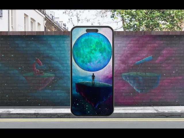


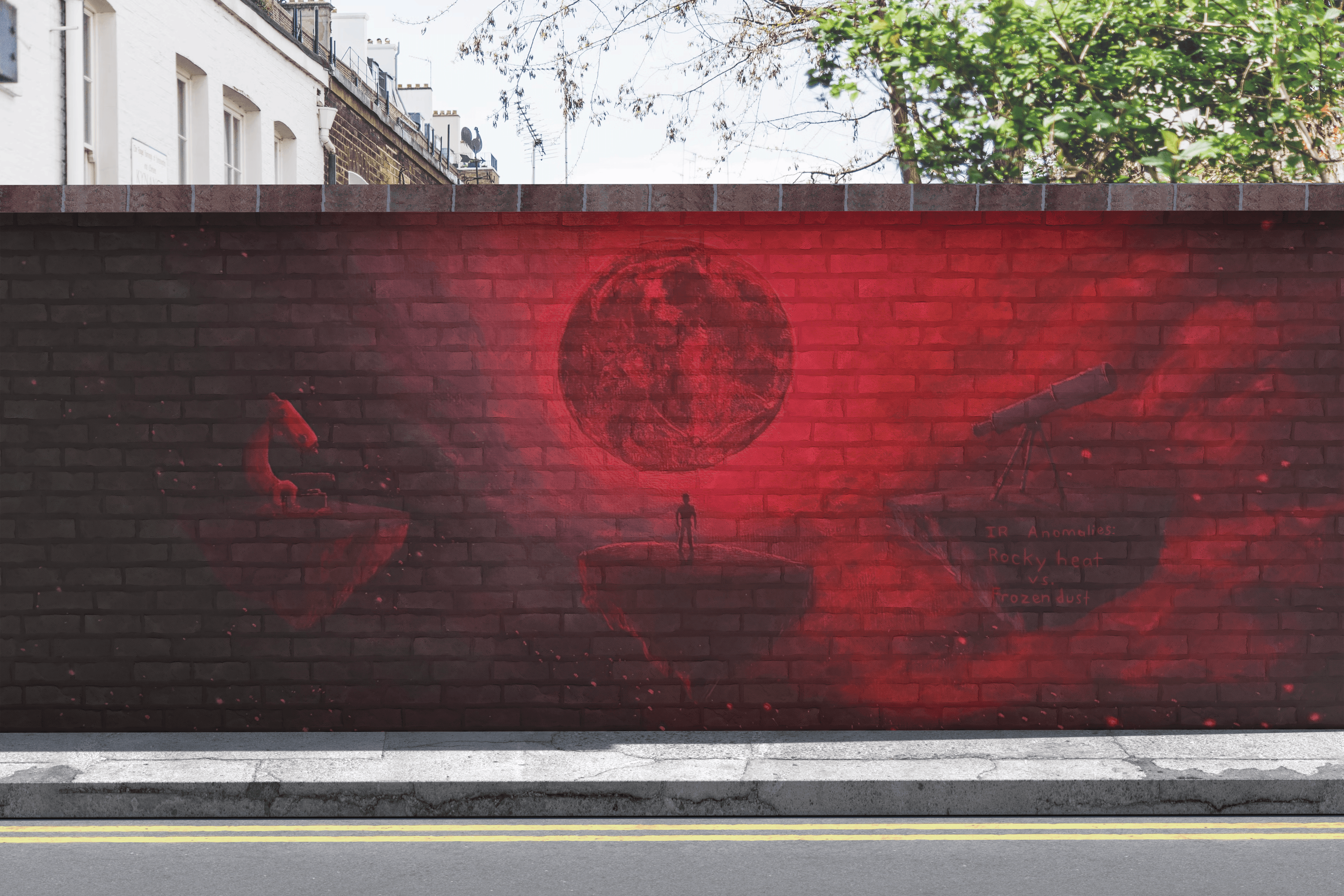

My goal is to create an exhibit that will attract people’s curiosity toward science through design. I plan to do this by using the exhibit to show fun interactive experiences to keep people engaged in scientific topics they might otherwise show little interest in. The exhibit will feature a mural with Augmented Reality components. Two of these components will feature zoom effects and one will feature transitional imagery. To view the AR, users would have to download the Artivive App and then scan the trigger images on the mural. Prior to this project I hadn’t ever really explored augmented reality. I had many questions in the beginning regarding its feasibility and how I might go about executing it.
Click here to read more about the sketching phase
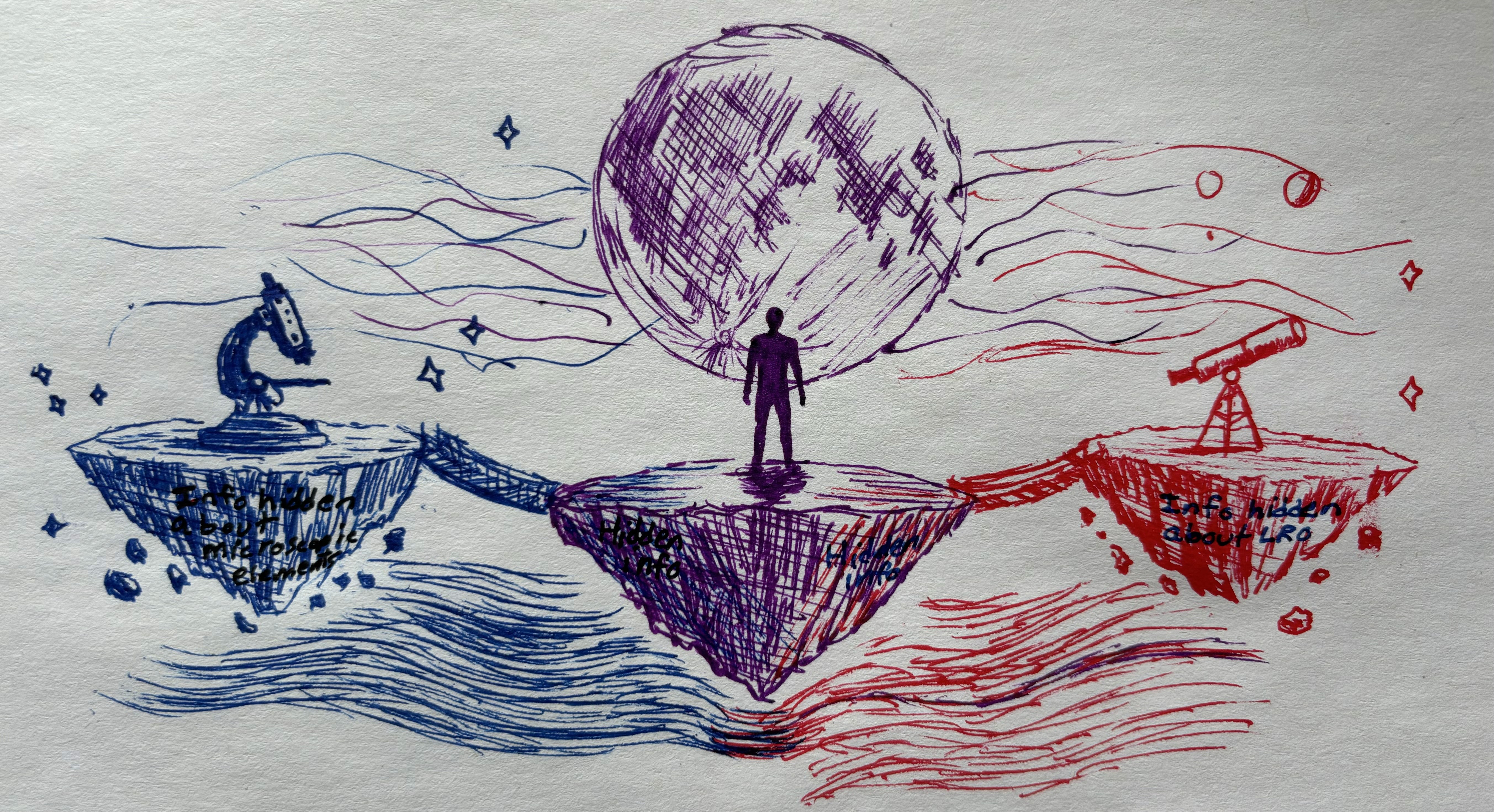
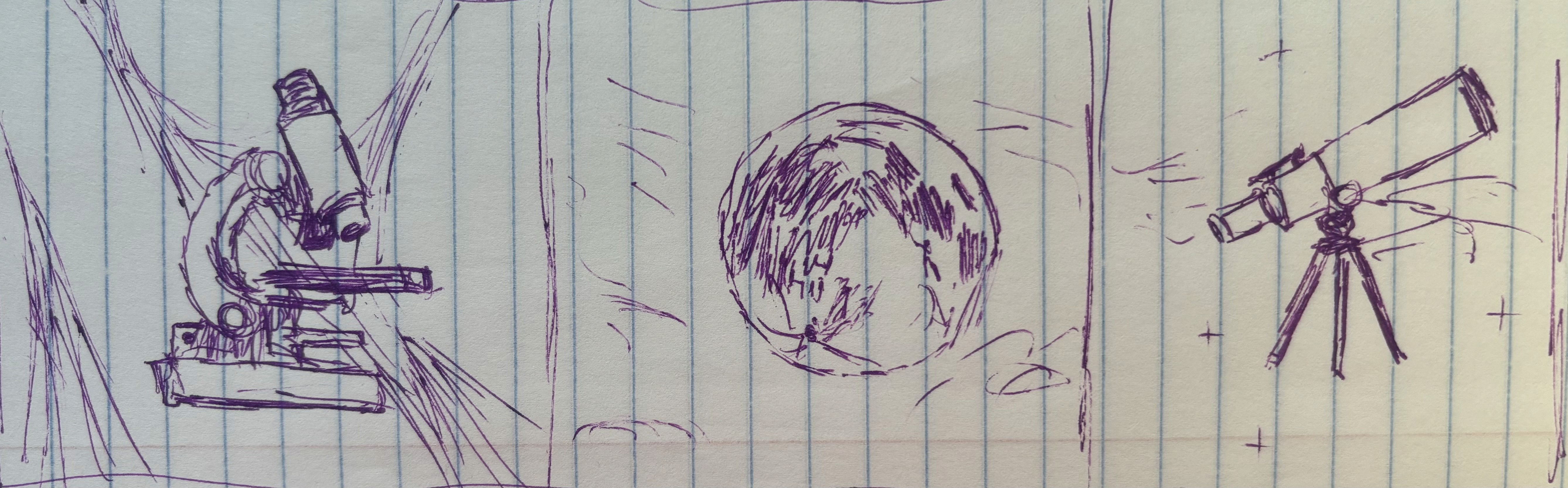
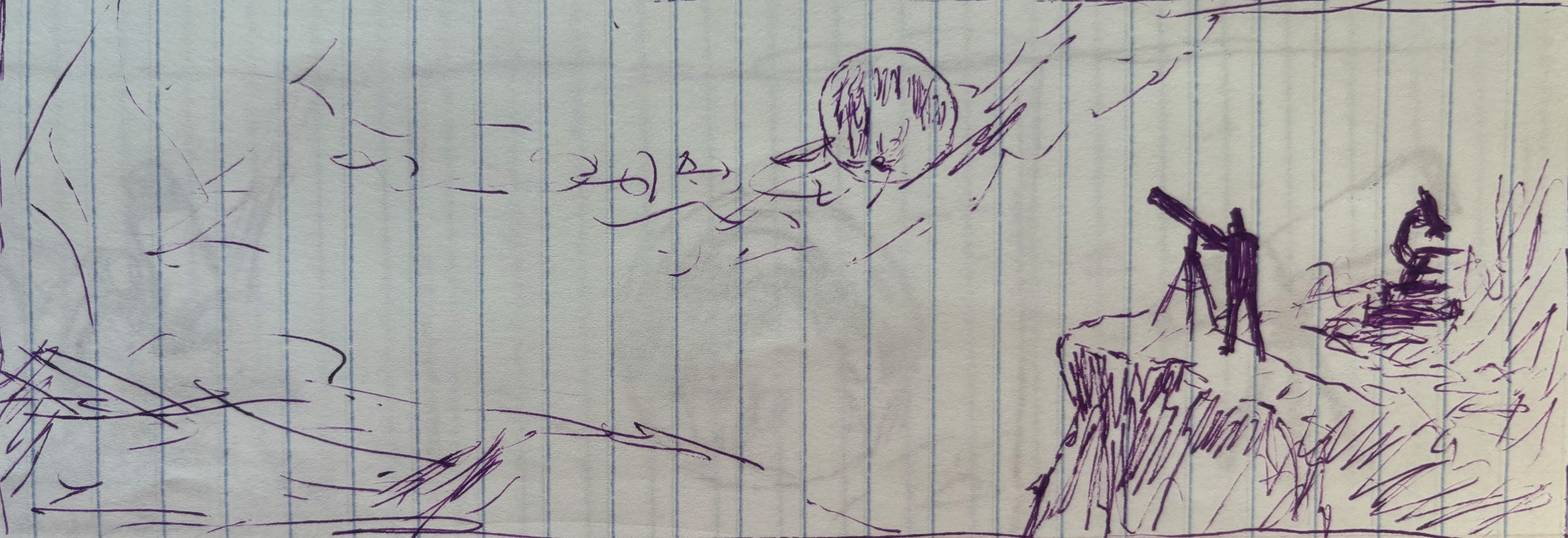
AR Prototype:

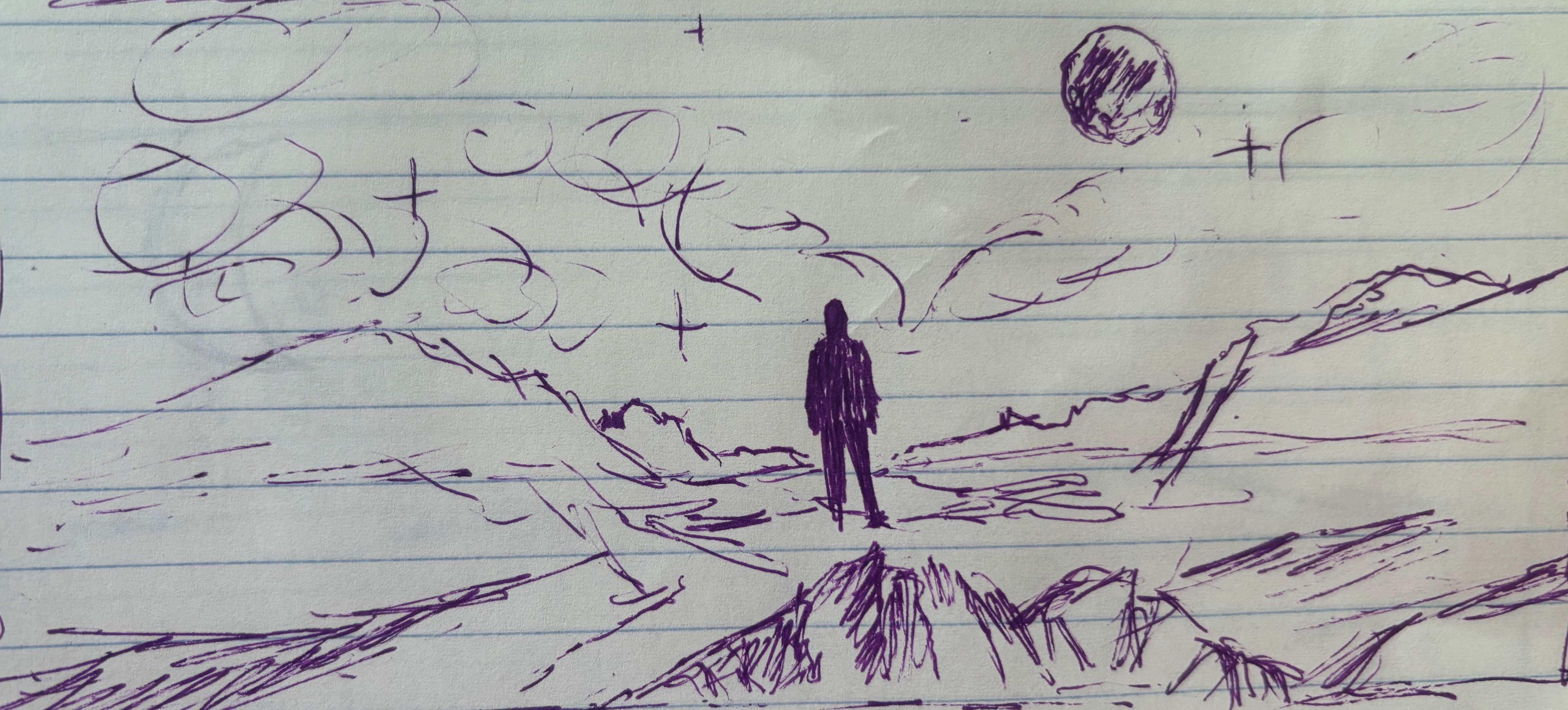
Lunar Component:
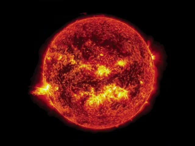
When viewing the Lunar component, the first thing you see is a photograph of the full moon. This is a photo I took through my Orion telescope at home. I’veseen some cool stuff through that telescope (planets, moons, stars, nebulas). This photo represents the visible spectrum of light when viewing the moon. It then transitions into what can be described as a warm tone image of the moon. This first iteration of the moon is an infrared heat map of the moon. In the AR, the image of the infrared moon then transitions into one with blue and green highlights. It is a representation of the moon in ultraviolet radiation.
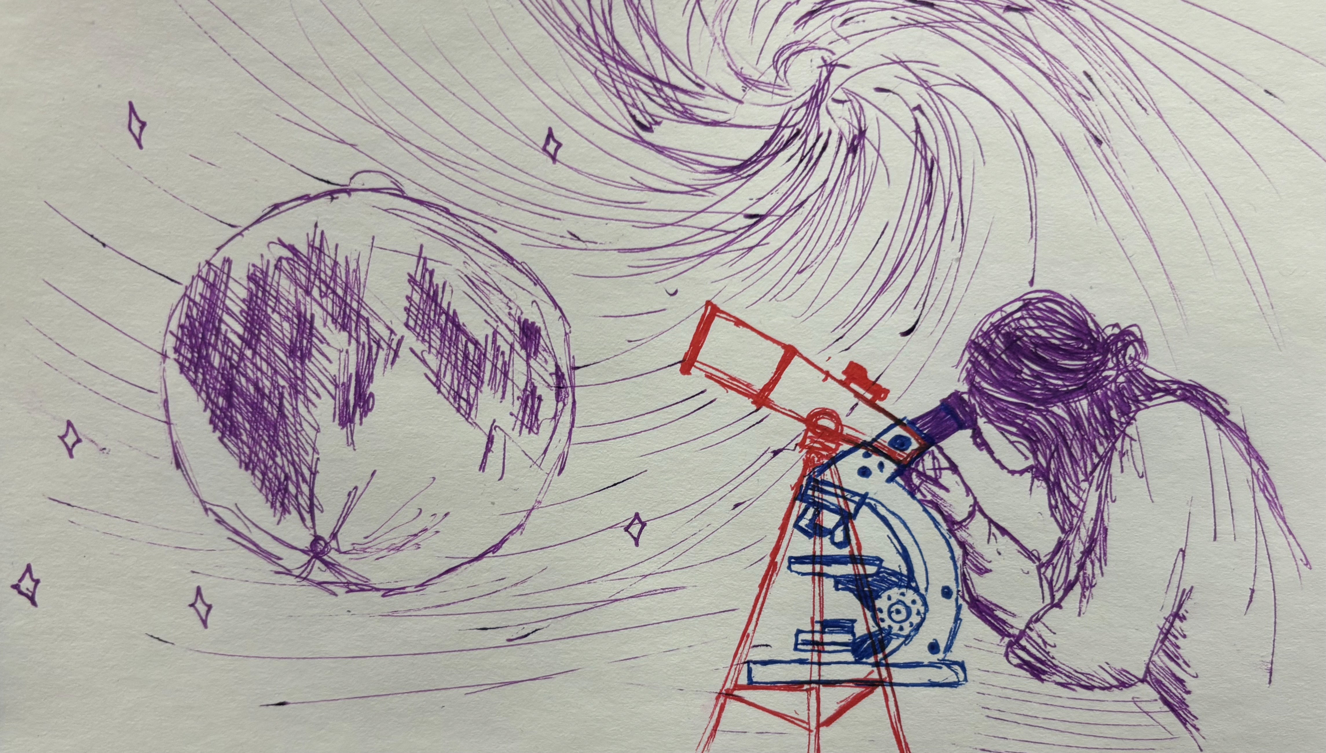
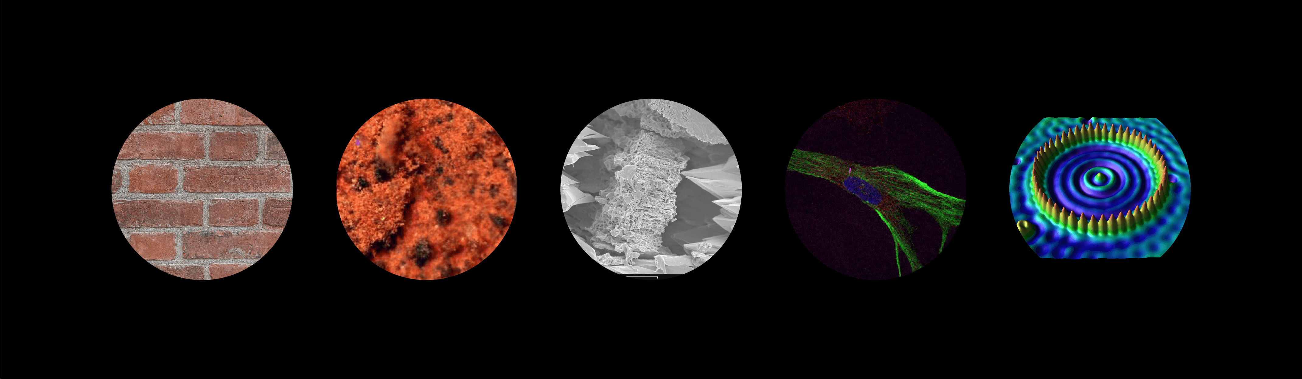
Microscopic Imagery:
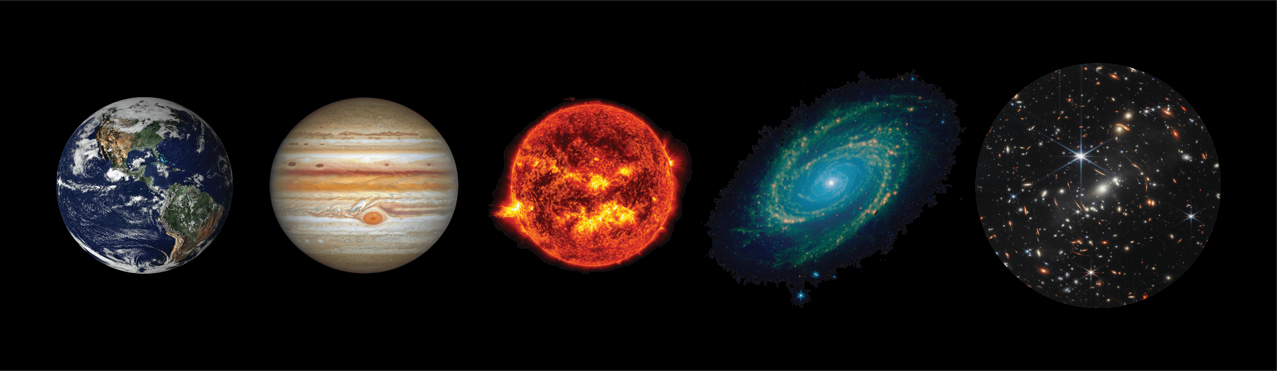
Cosmic Animation Imagery:
In the end, I was able to learn a lot about a wide range of topics while pushing my design skills outside of my typical scope. I think going forward I will try to pursue more projects like this one. I hope to become more proficient at designing augmented reality animations. This project opened me up to the field of science communication and the impact designers can have in that field. If I had more time, I’d explore creating 3 dimensional animations for the AR. I’d probably present the concept to places like the Franklin Institute to try and create the exhibit in a professional setting. I’m curious what you think of this project. How did this impact you? Was it successful in evoking curiosity? What else could I explore to make this concept more effective?
View the Augmented Reality Animation here: