Project Overview:
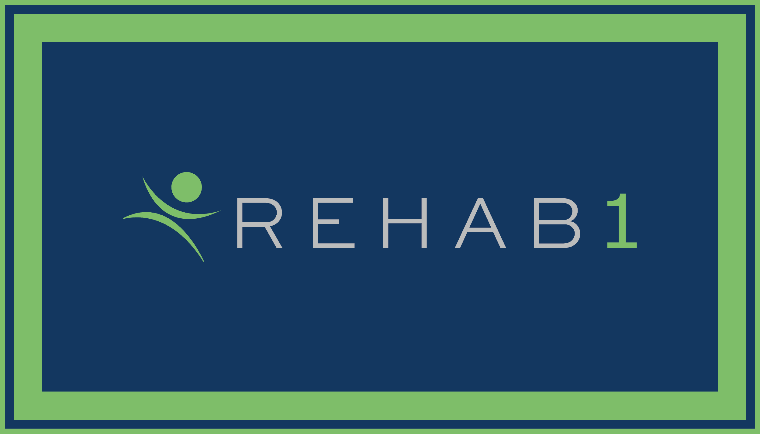
REHAB1 needed a comprehensive visual refresh to modernize its identity and establish consistency across print and digital touchpoints. Partnering directly with the CEO, I led the redesign of the logo, established a versatile color system, and produced a suite of production-ready collateral ranging from internal employee assets to external recruitment materials.
Logo & Brand Identity System:
To achieve a modern aesthetic, I selected a clean typographic pairing of Verdana and Sweet Sans Pro Light for the core wordmark.
Logo Versatility: Designed flexible mark variations to accommodate diverse backgrounds, including an all-green version using the signature primary color, as well as configurations pairing the green icon with dark or light gray typography.
Secondary Marks: Developed circular icon variations specifically scaled for smaller digital and print applications where the primary wordmark is too detailed.
Color Palette: Collaborated through iterative feedback with the CEO to refine a 5-color system


Apparel:
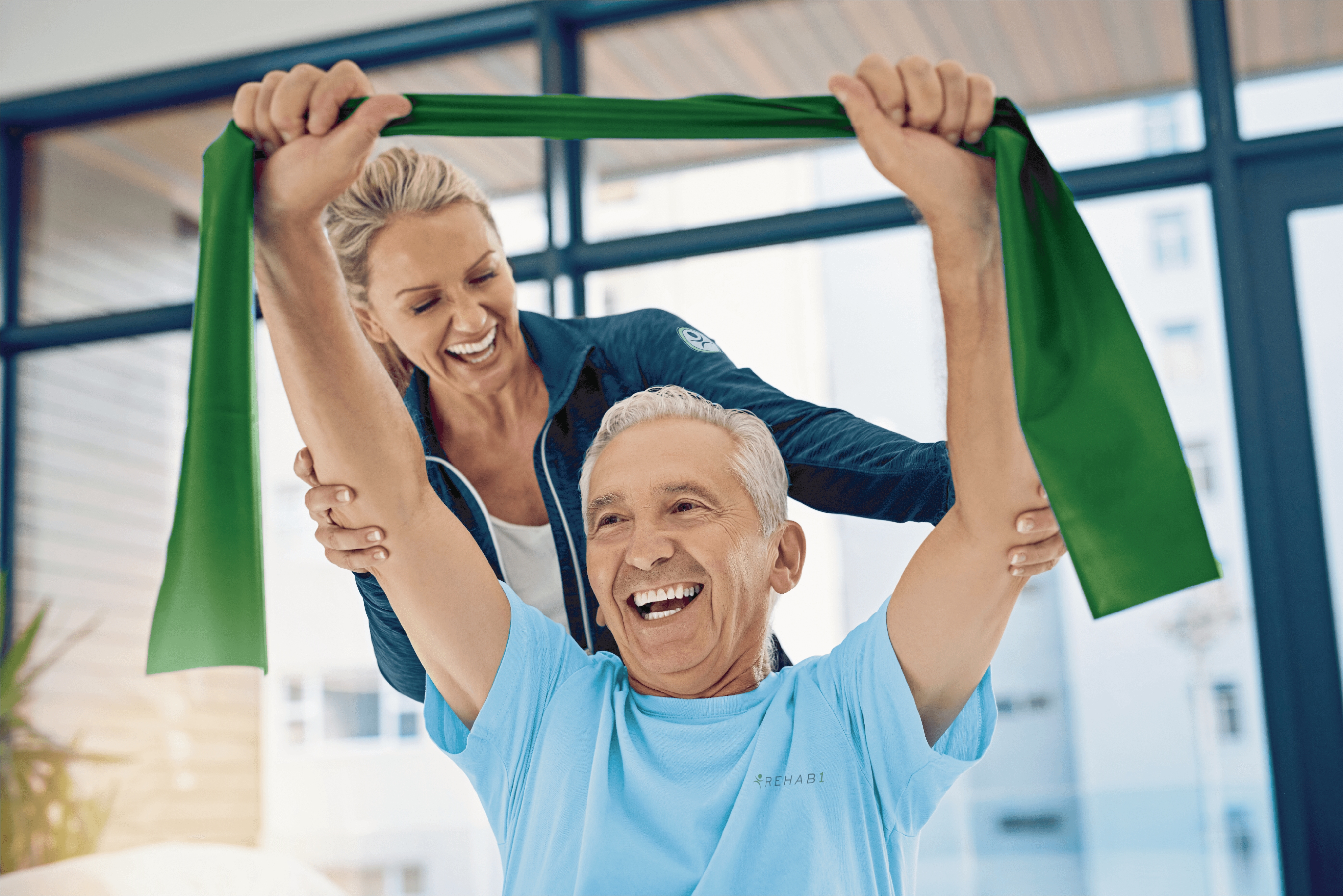
Created clean, minimalist t-shirt designs featuring the primary logo. Produced two options: a light blue tee with dark gray branding, and a dark blue tee featuring light gray branding.


Corporate ID:
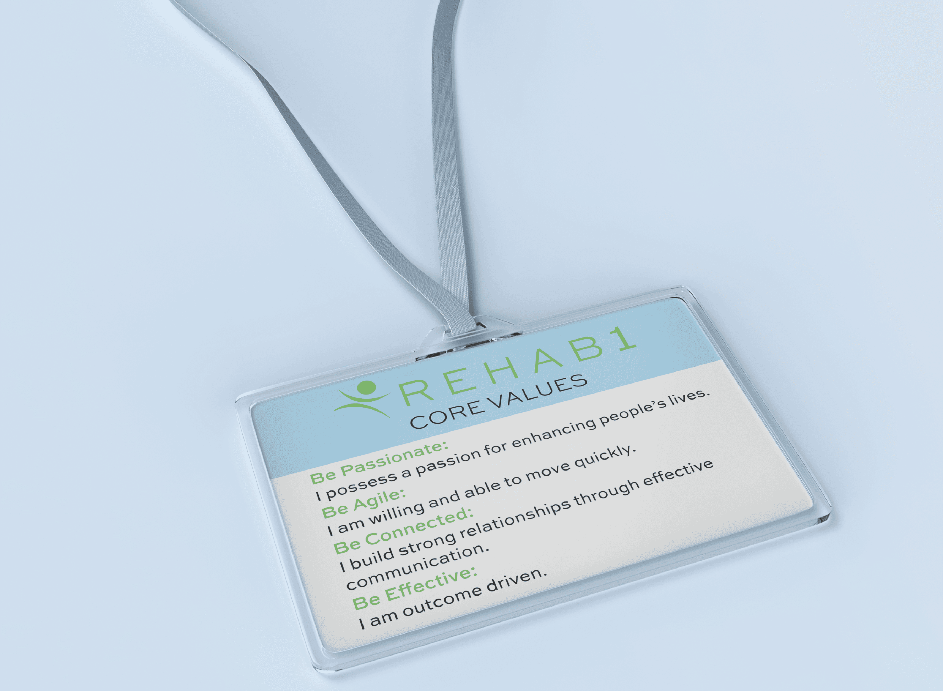
Employee ID Badges: Designed the front layout to house employee photos and identification clearly, and utilized the back to feature REHAB1’s core values.
Custom Lanyards: Researched print dimensions and technical specs to build a continuous step-and-repeat pattern featuring the logo against the brand’s color palette. Both the lanyards and badges were produced and distributed to all staff.

Employer Branding & Digital Outreach:
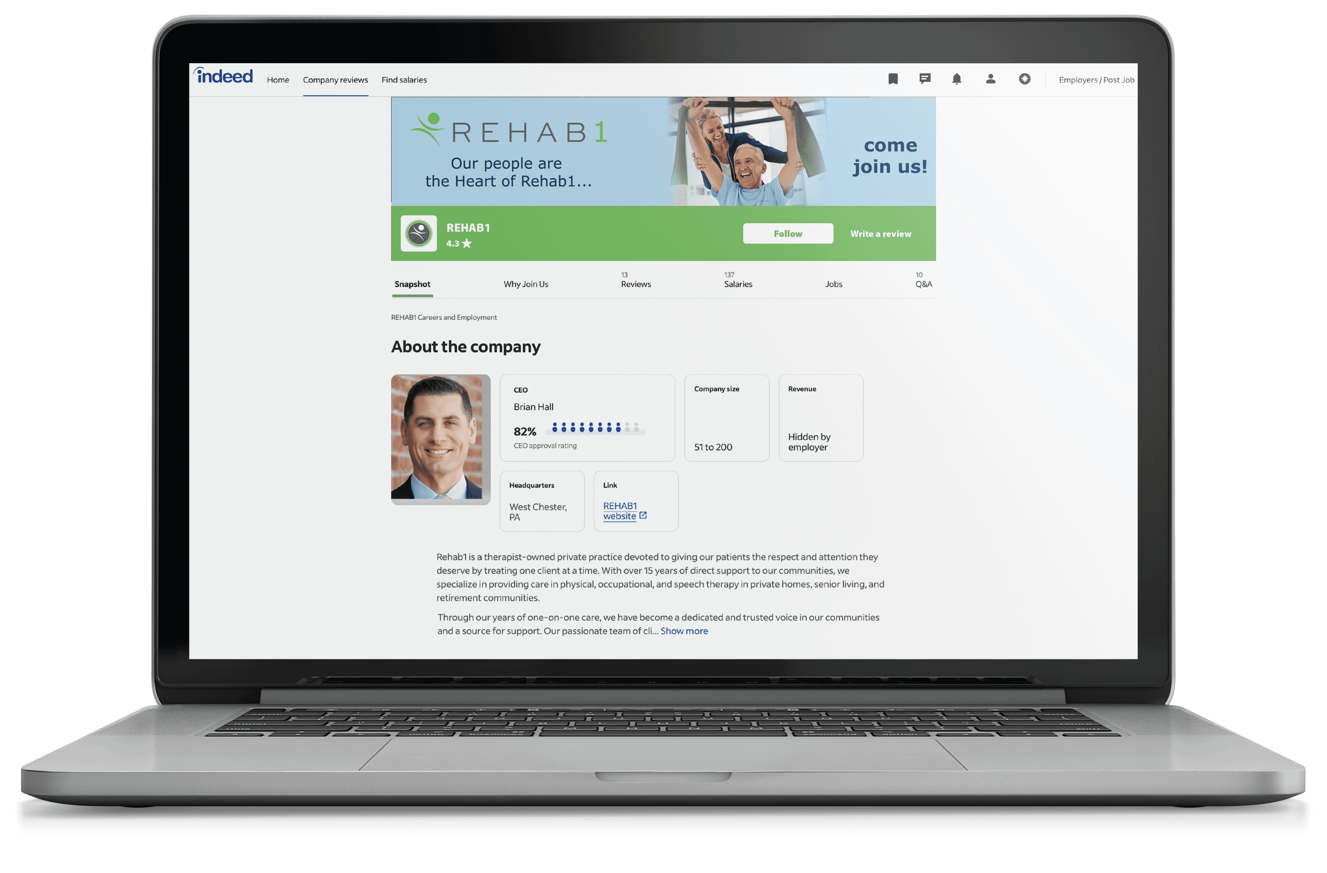
Redesigned REHAB1’s Indeed company profile to boost recruitment efforts and improve candidate engagement.
Header Banner Design: Collaborated with the CEO on headline copy ("Our people are the heart of REHAB1... come join us!") set over a light blue background.
Custom Photo Editing: Composite-edited a stock image to show a physical therapist and patient wearing REHAB1 apparel while using a branded green resistance band.
Marketing Collateral & Print:
Event Marketing: Created targeted promotional signage, including a raffle giveaway sign for B2B mixers and networking events.
Facility Signage: Updated existing internal posters and complex informational graphics—such as the Fall Reduction Roadmap flowchart—to match the updated brand guidelines.
Sticker Designs: Developed two custom stickers: a standard rectangular logo design and a fun "Your Part-B Provider" sticker featuring a custom bee vector graphic.