Philadelphia Soccer Foundation

Philadelphia Soccer Foundation

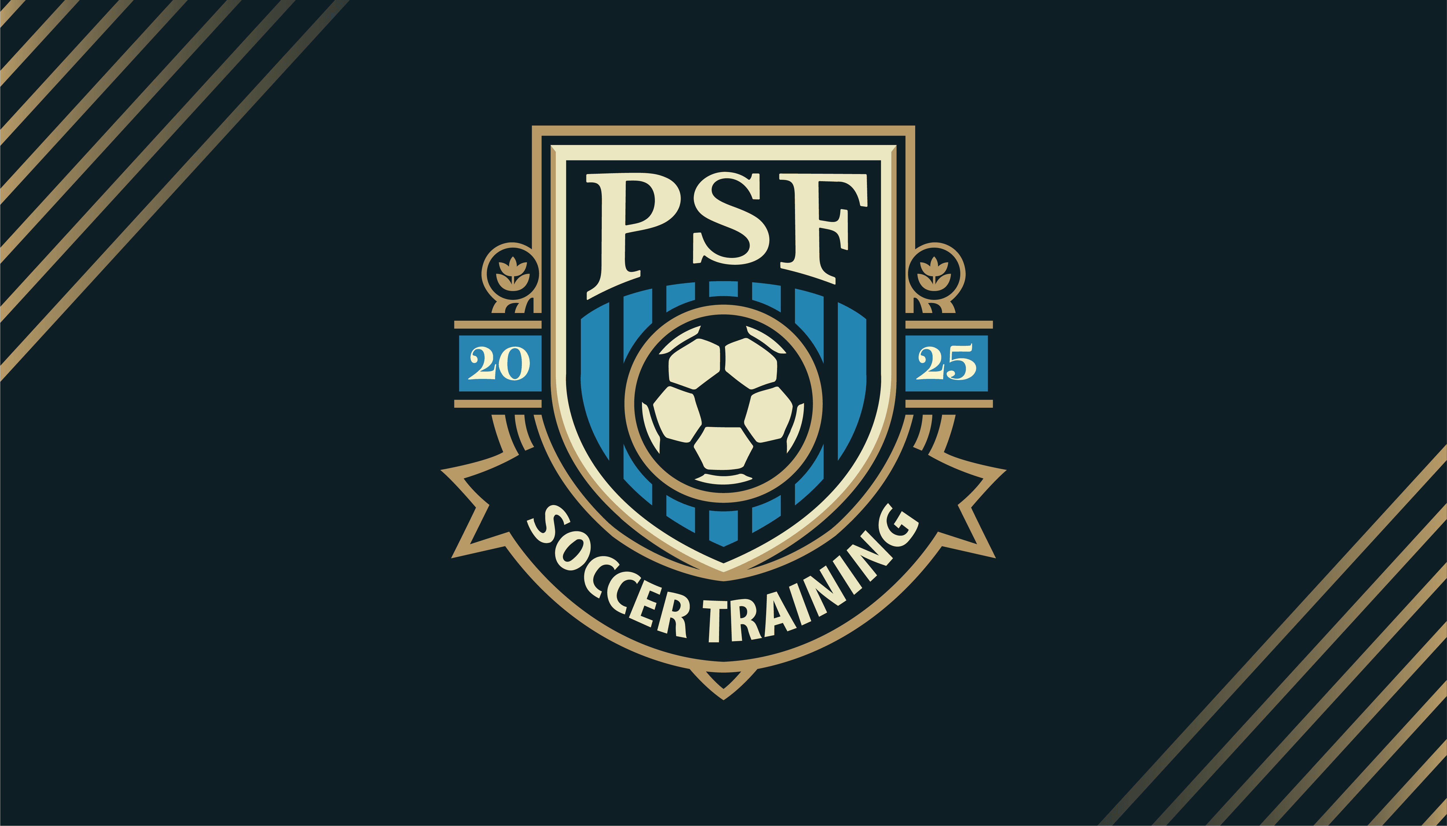
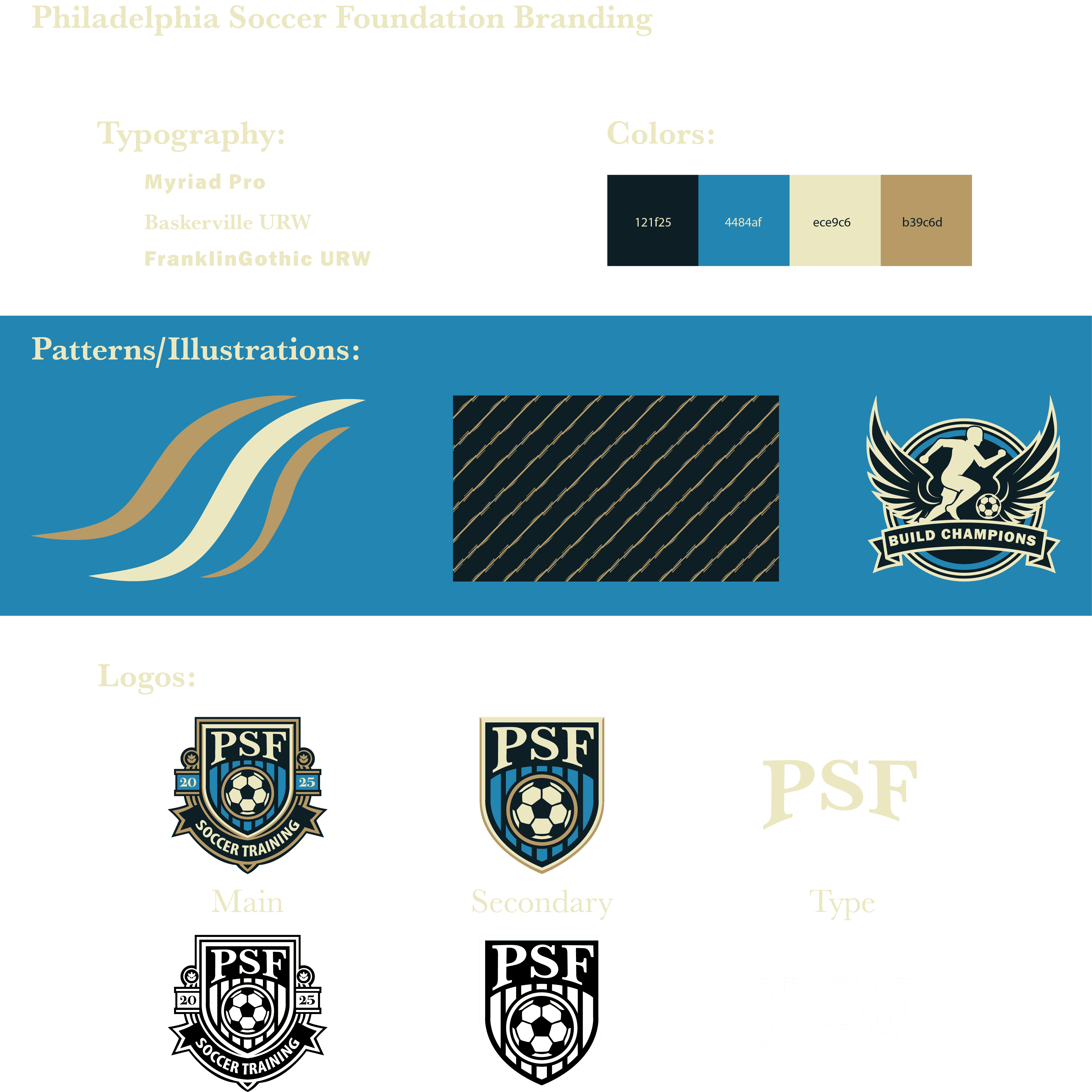
The goal for this project was to design a comprehensive brand identity for a start-up youth soccer training program to portray a premium, high-level coaching academy. The brand needed to appeal strongly to ambitious youth players while assuring parents of the program's professional focus to prepare athletes for the Collegiate Pathway.

Client


Philadelphia Soccer Foundation

Client


Philadelphia Soccer Foundation

Timeline


1 Month

Timeline


1 Month

Tools


Adobe Illustrator, Photoshop, InDesign

Tools


Adobe Illustrator, Photoshop, InDesign

Core Brand Mandate:


The primary goal was to convey an atmosphere of serious, aspirational training, distinctly setting PSF apart from typical recreational programs.

Key Insight:


The emotional core of the brand needed to be aspiration and excellence, leading to the program's key thought: "Where Champions Are Built."

Identifying Trouble Areas:

We conducted user research through Mircrosoft forms surveys and interviews with users to understand where eBay was failing. In addition, we went through the site and conducted a current state analysis. The next step was organizing the data and creating user personas. We took these findings to a graph between impact and effort to find changes with the highest value to the user with the lowest amount work.

Current State Analysis:


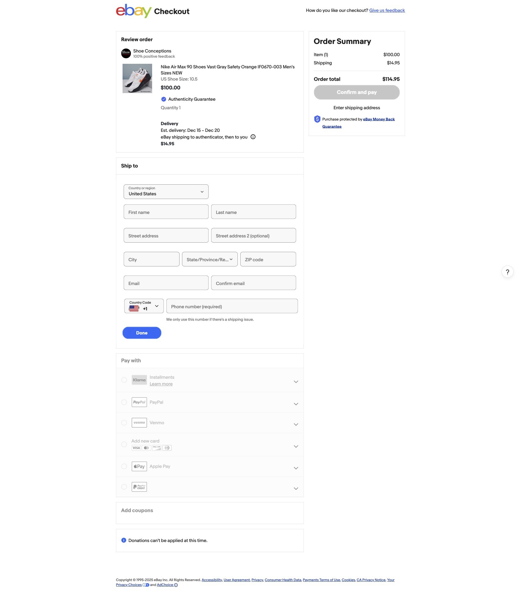
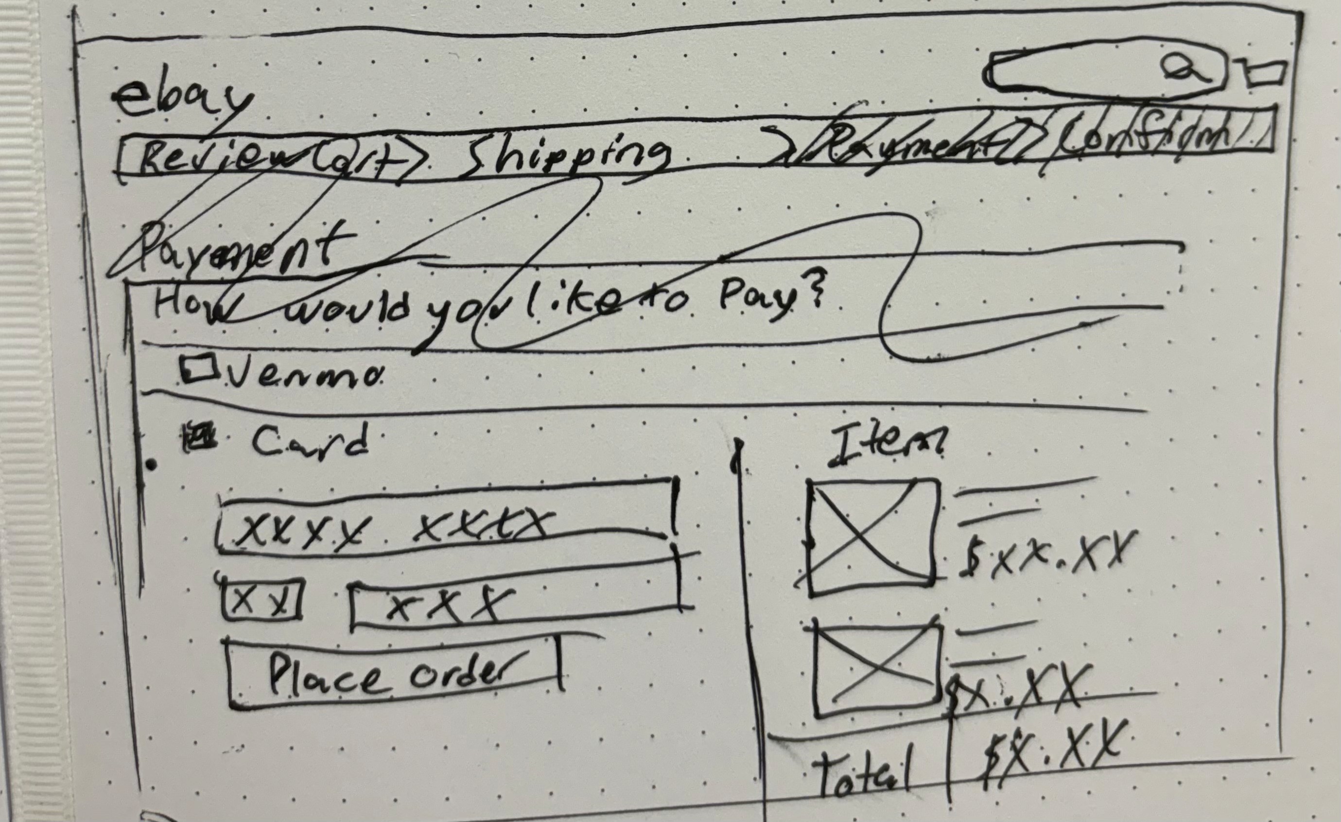
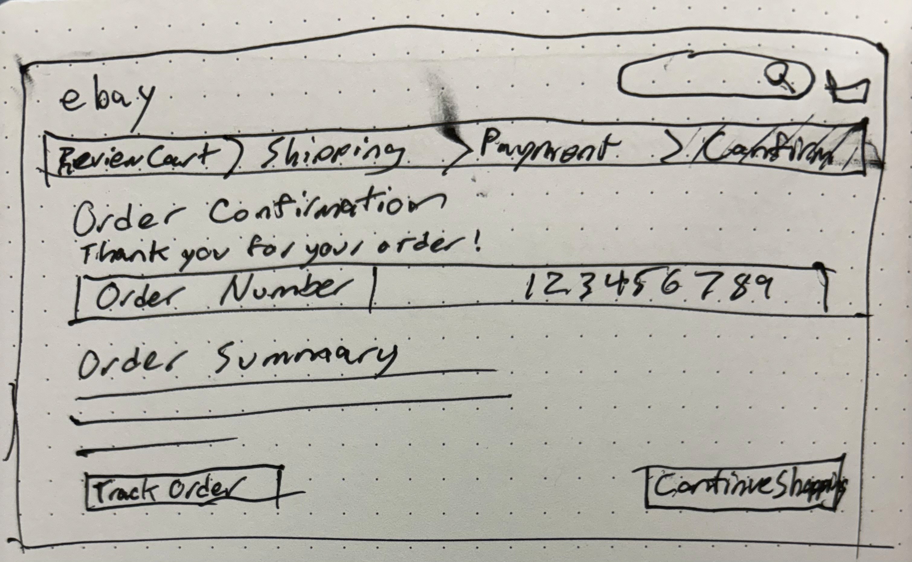
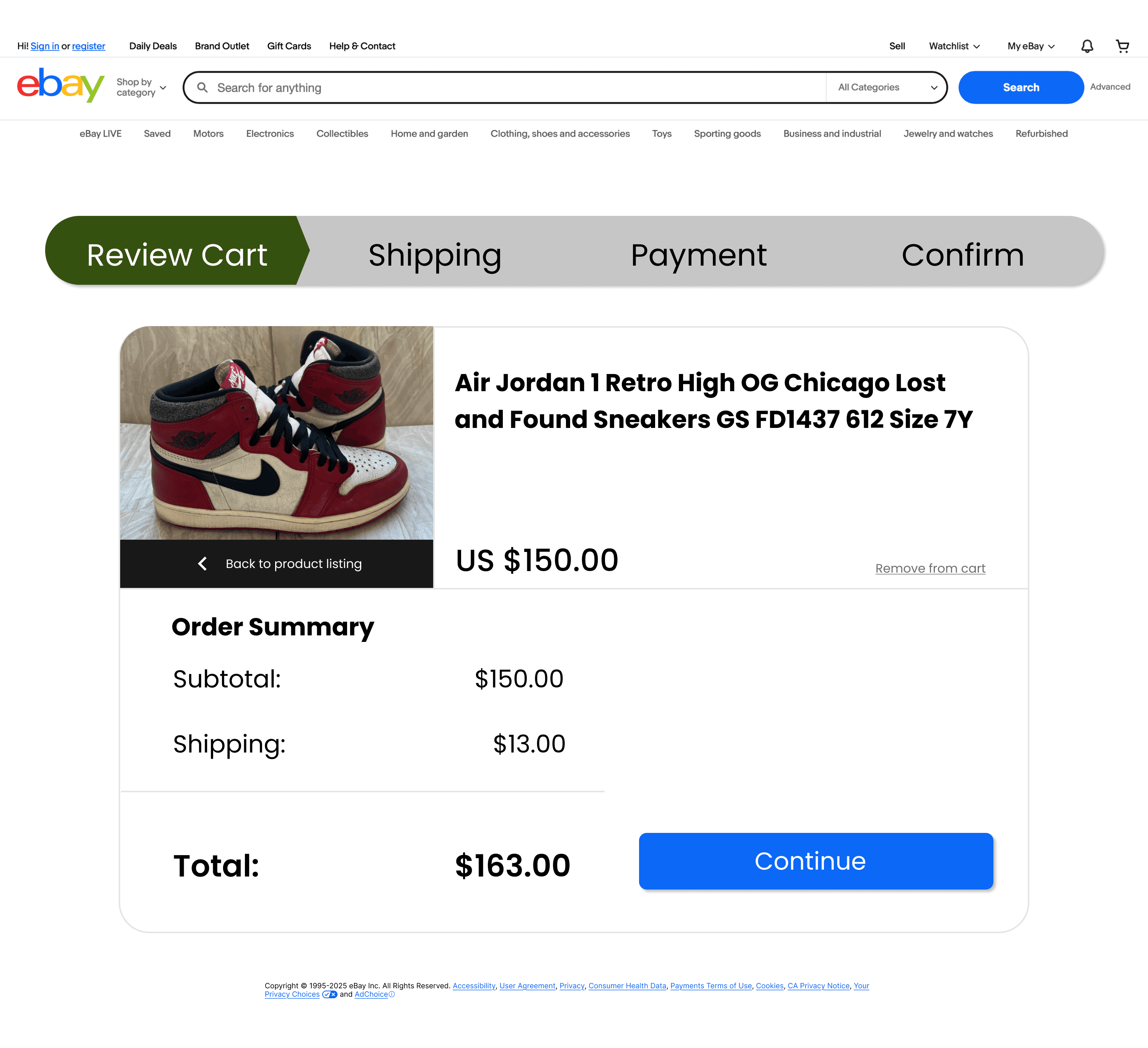
Pictured to the left is the current state of the eBay Checkout process. The whole process is placed on to one, long, single-scroll page. It shows the user a lot of information all at once and leaves the user with no way of keeping track of their progress as they fill out the information.

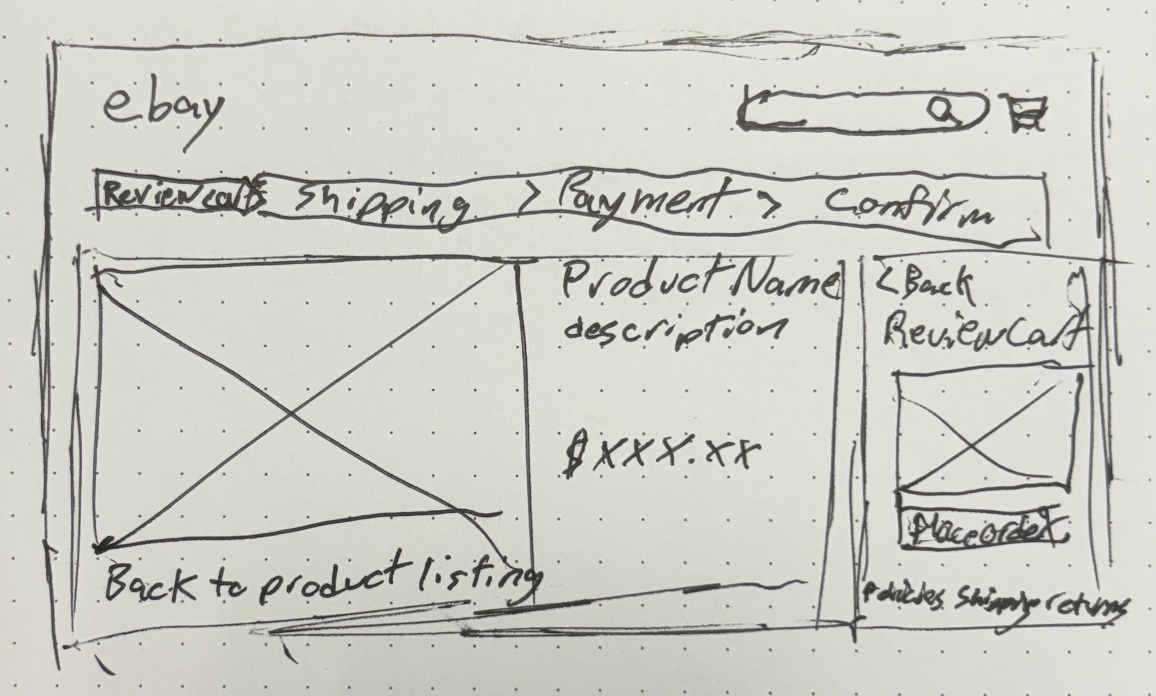
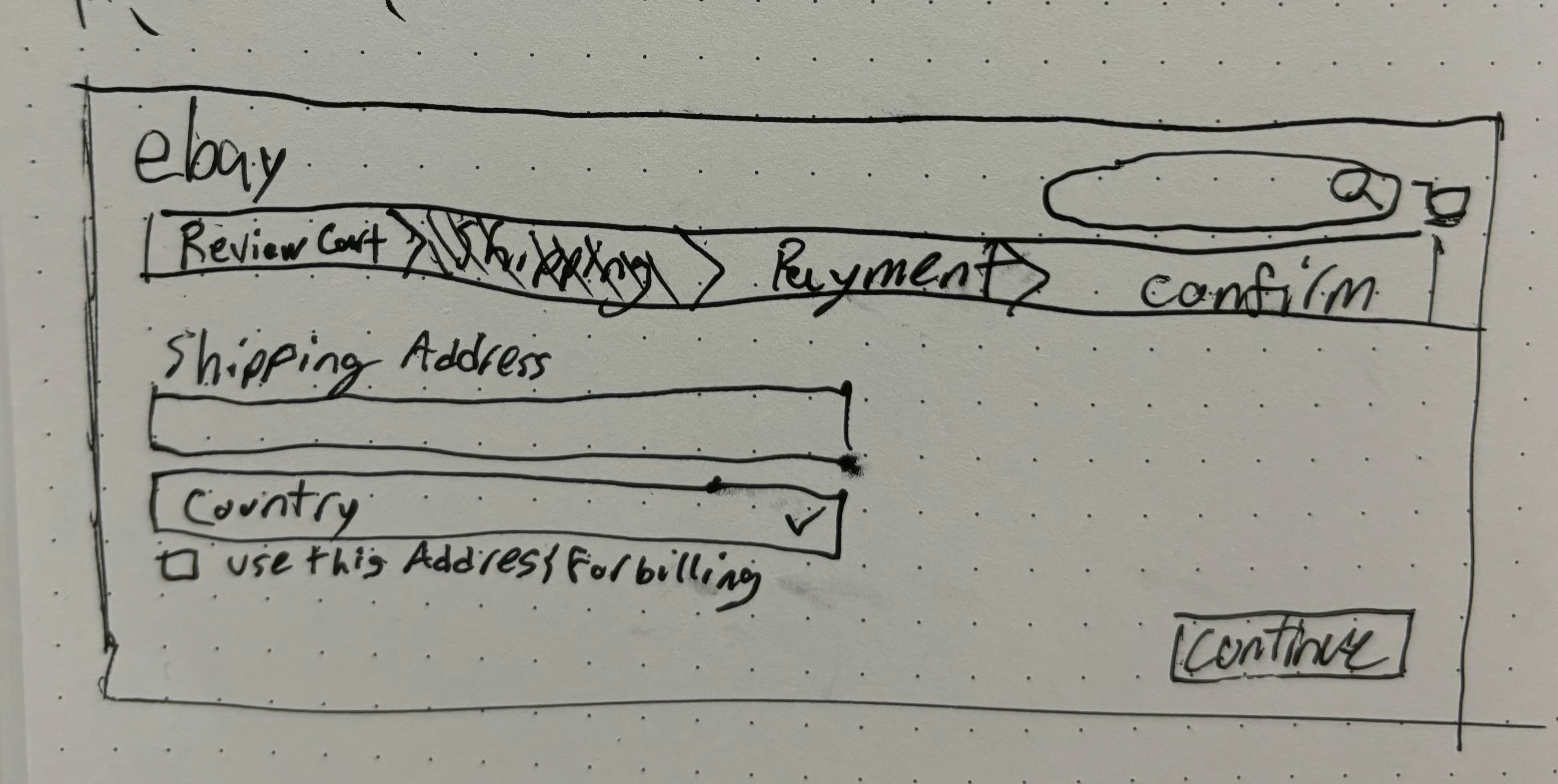
Click here to read more about the sketching phase

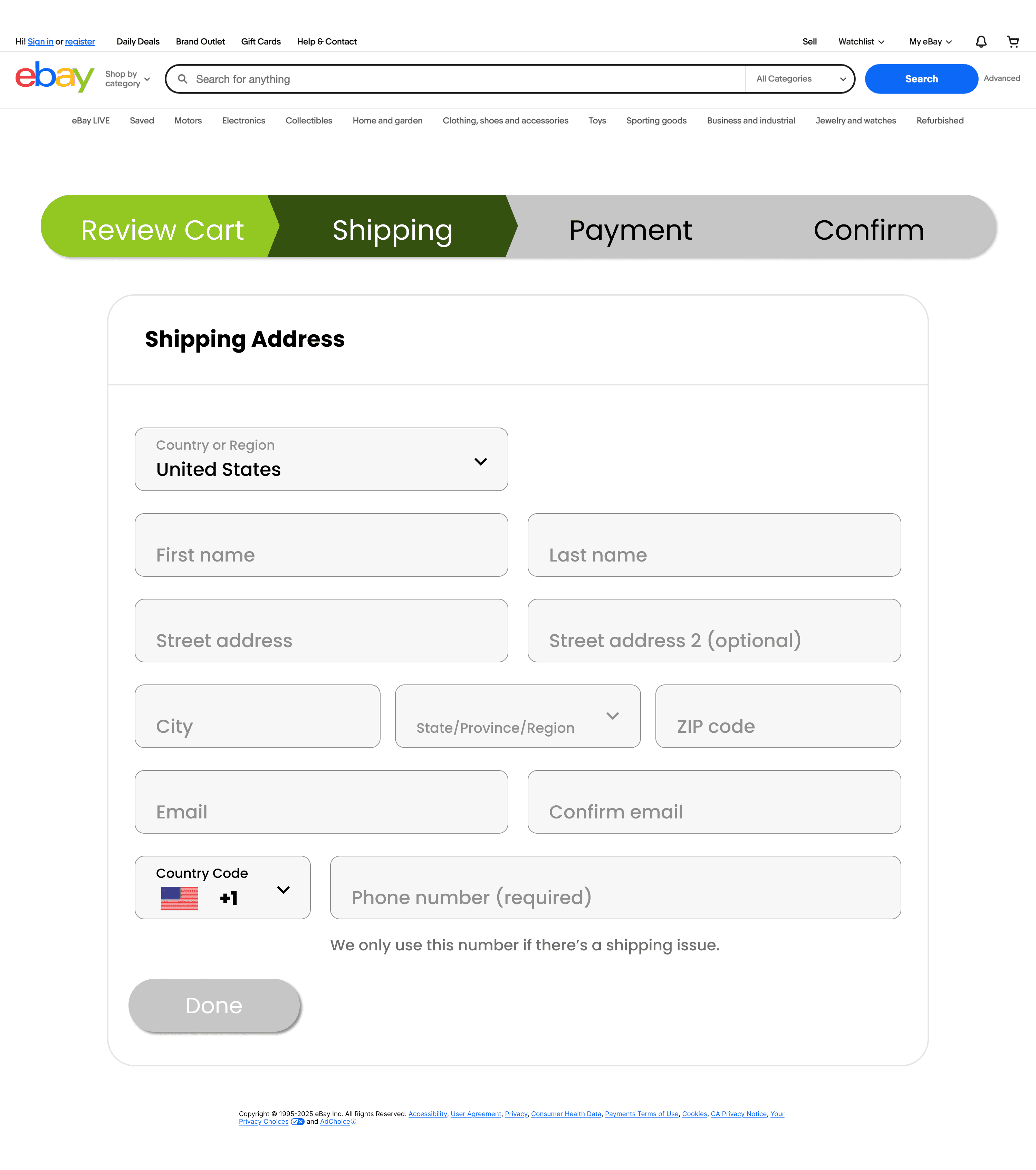
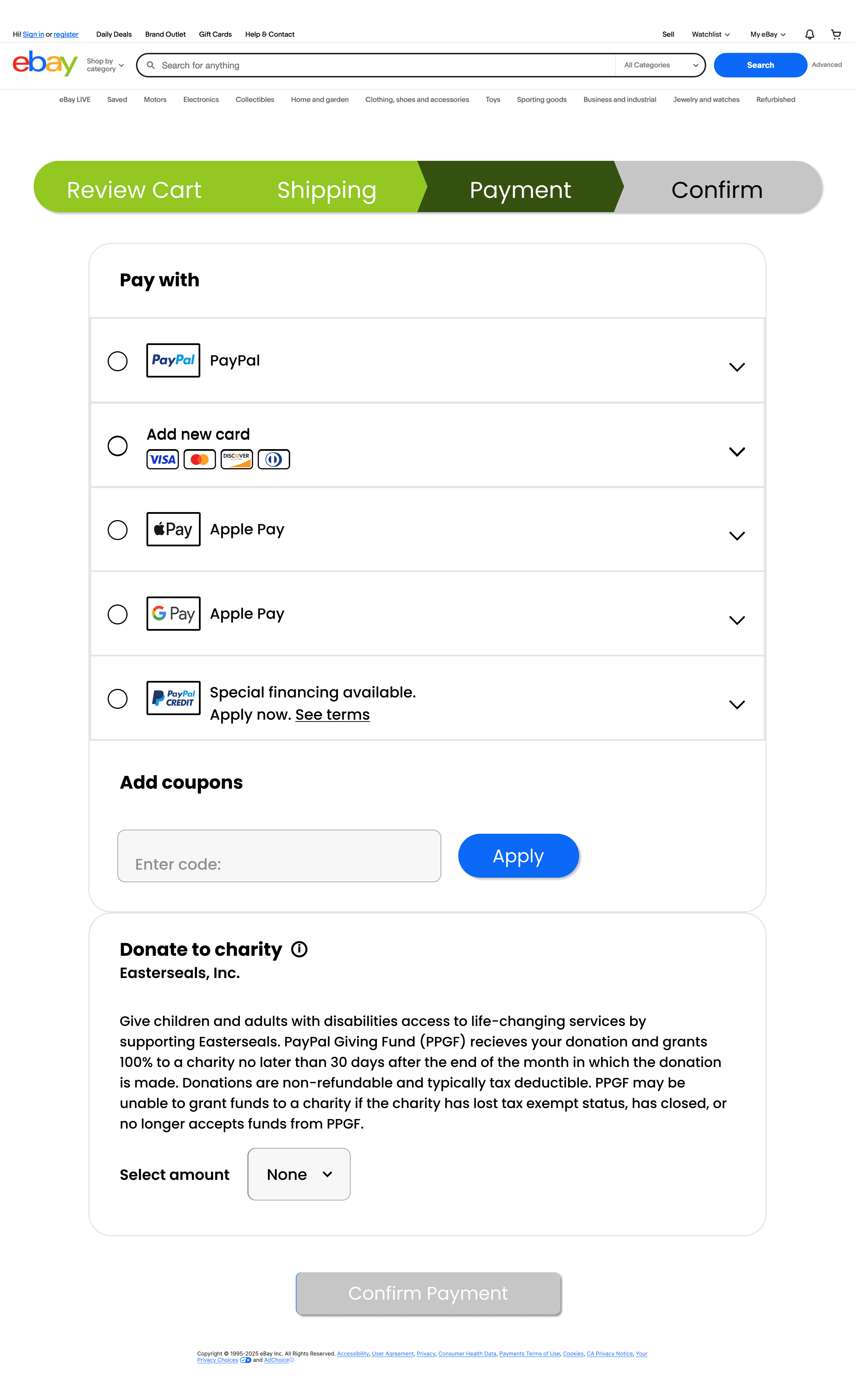
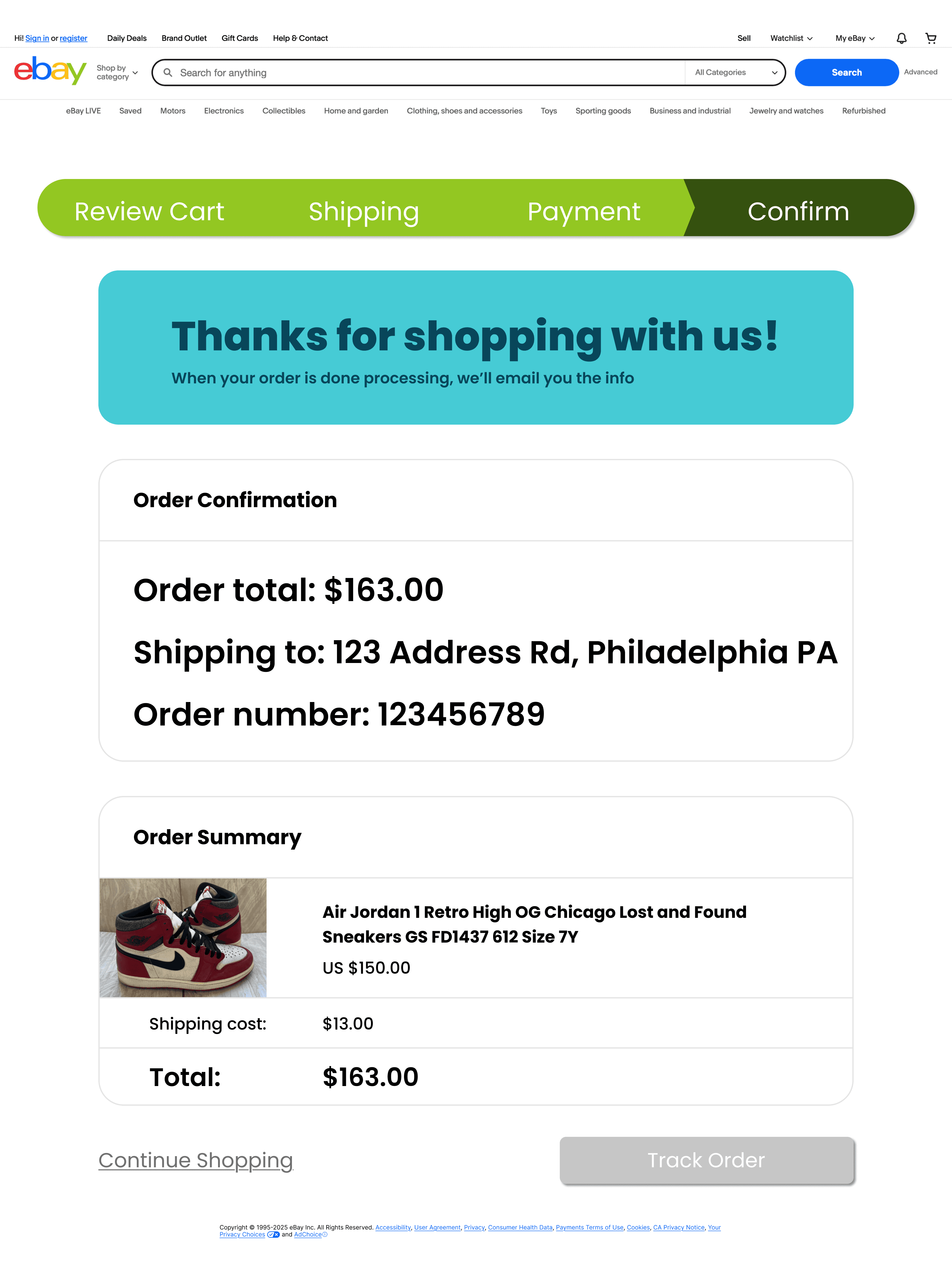
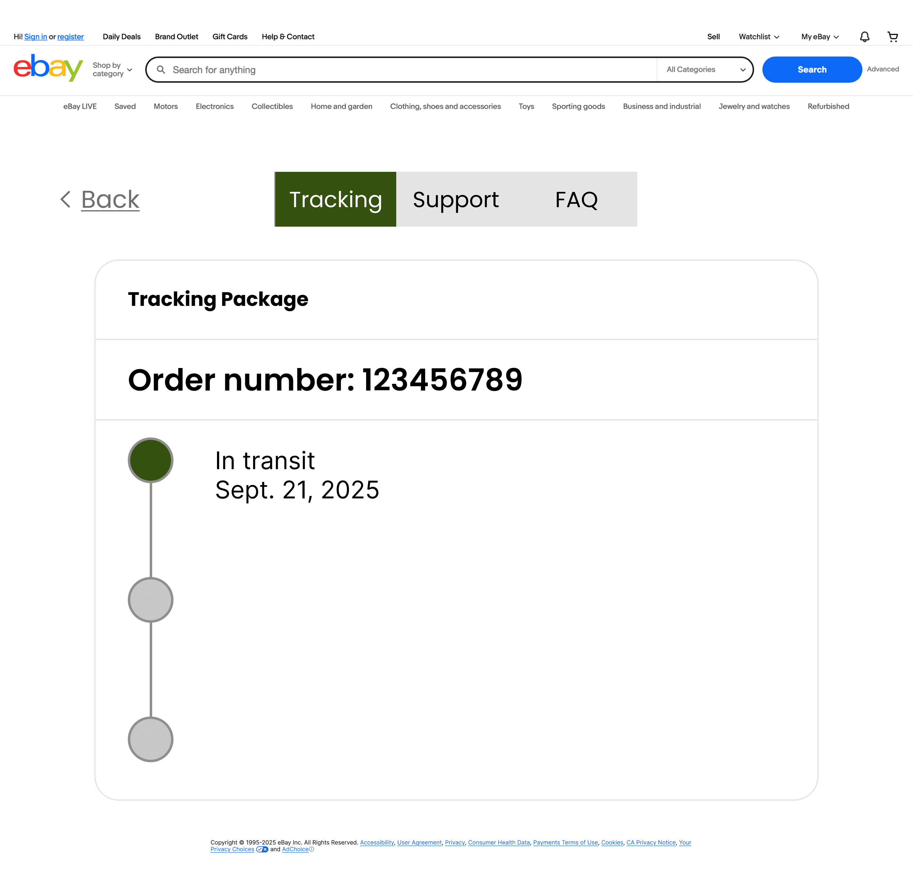
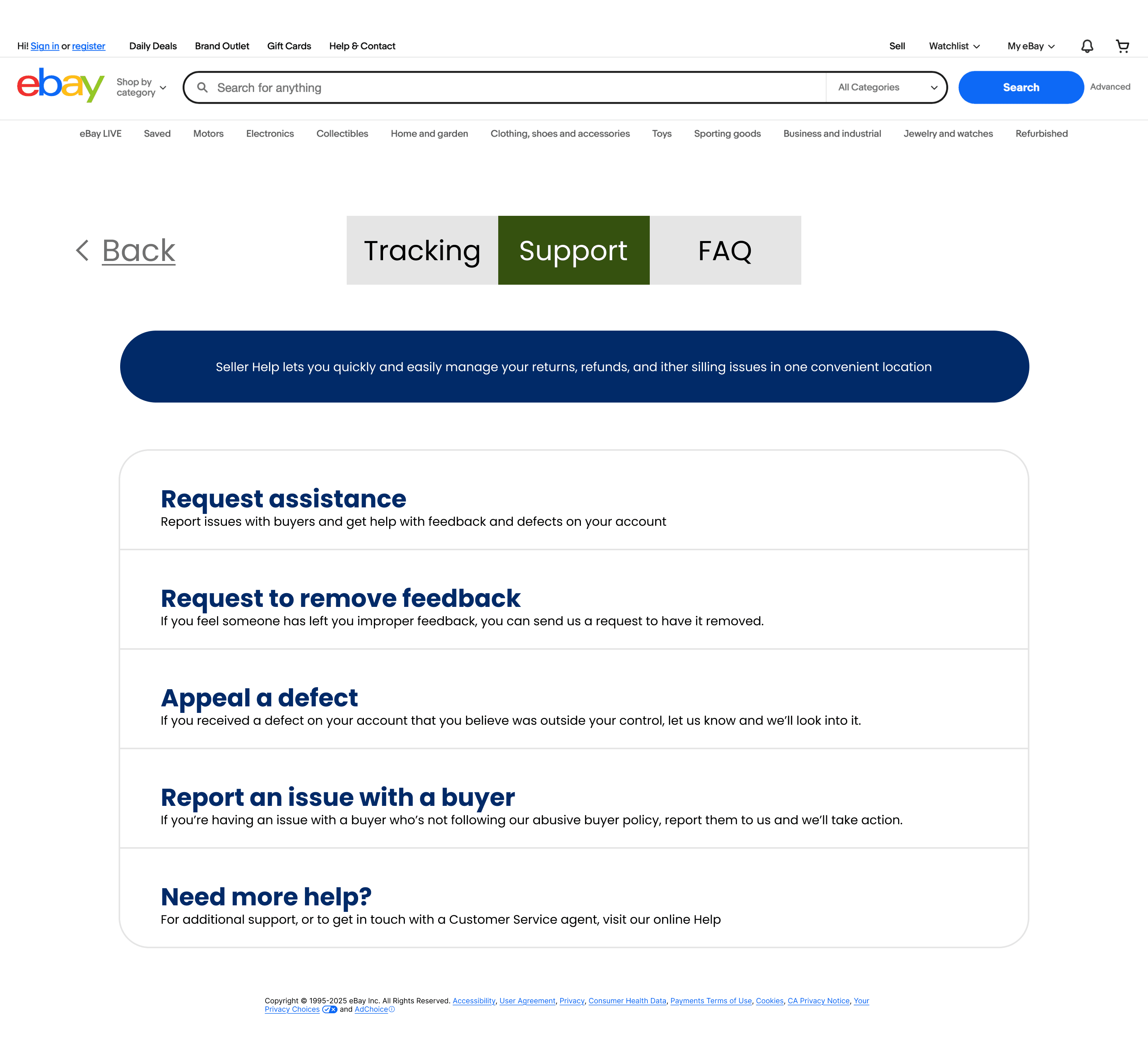
The finalized prototype included hover states for the progress header buttons, in case a user wishes to review previous progress, as well as clickable buttons to view what the pages would look like as the user fills out the information and upon completion, navigating to the next step in the checkout process.

View the Figma prototype here: