
Project Overview:
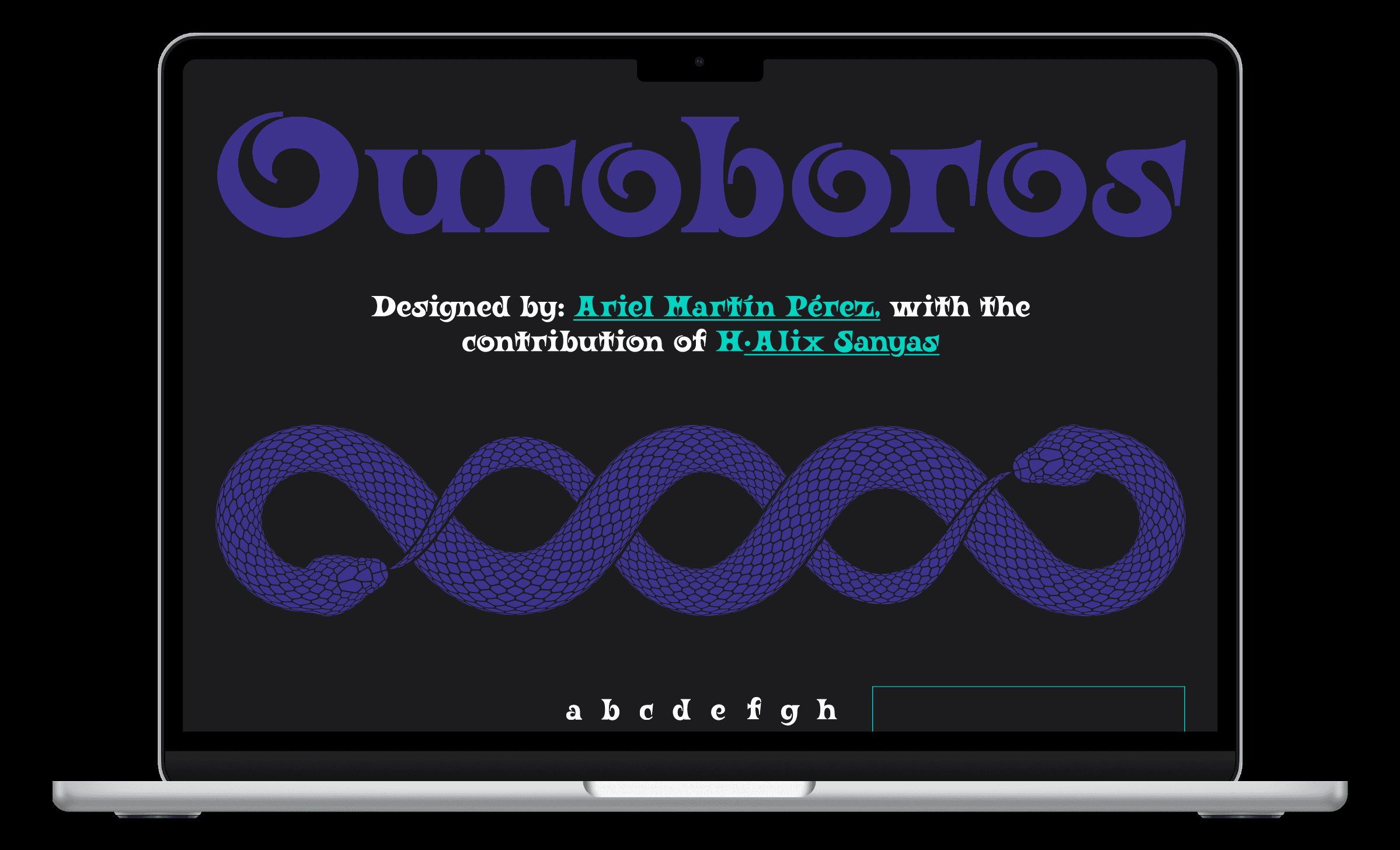
This responsive prototype was inspired by the theme of infinite cycles, which are shown through the expressive design of the Ouroboros typeface. The dark UI utilizes a high contrast palette of royal purple and electric teal, letting the organic curves of the typeface sit alongside fluid serpent motifs. The project explores the boundary between digital editorial layout and interactive visual storytelling across desktop and mobile viewports.

Color Palette:

The Mobile Translation:
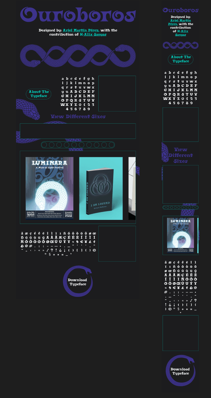
To maintain the typeface’s bold, expressive personality on mobile, I reflowed the wide editorial grids into a focused, single-column hierarchy. Key typographic hero elements were scaled proportionally to ensure the intricate, Art Nouveau-inspired curves of Ouroboros remain the undisputed focal point of the portrait viewport.

The Mobile Prototype:
This walkthrough demonstrates the mobile prototype’s touch-centric navigation. Large, tap-friendly interaction zones and
fluid transitions ensure that exploring the glyph map and scrolling through editorial compositions feels seamless and tactile on handheld screens. Interactive behaviors were also refactored for mobile: the desktop version's hover states were replaced with active tap targets, allowing mobile users to click directly on the glyph map to view high-fidelity character close-ups.
Typeface in Use:
To demonstrate the adaptability of Ouroboros, I developed a series of design concepts spanning print, music, and merchandise. By pushing the typeface into distinct thematic territories, these mockups prove how the font's organic curves and bold weights command visual hierarchy across diverse physical and digital mediums.


Designing the Ouroboros specimen site was a deep dive into balancing highly expressive, historic display typography with the strict layouts of responsive user interfaces. The project served as an exercise in interaction logic and proved that a digital system can feel both incredibly structured and organically fluid. By conceptualizing the typeface across desktop and mobile viewports, as well as distinct physical mockups, this prototype stands as a complete study on how cohesive visual identity, motion, and digital storytelling can bring a typeface to life.
View the Figma Desktop prototype here: