Luma Café
Project Overview:
Luma Café is a warm, earthy coffeehouse brand built around the concept of light, comfort, and community. Derived from the Latin word lumen, meaning light, the brand identity reflects the inviting, radiant atmosphere of the physical coffeehouse space. The visual system balances structured geometry with a rich, illustrative brand language to evoke a deeply rooted sense of connection.
The Mark:
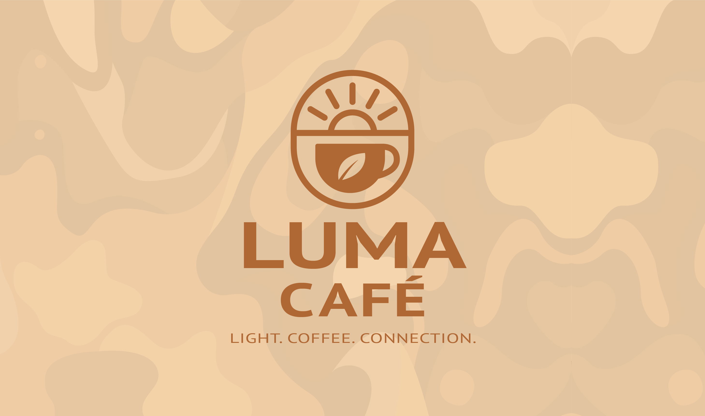
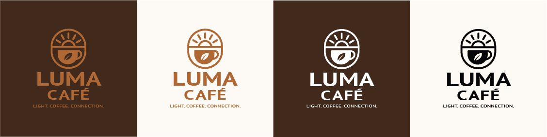
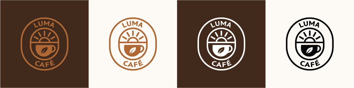
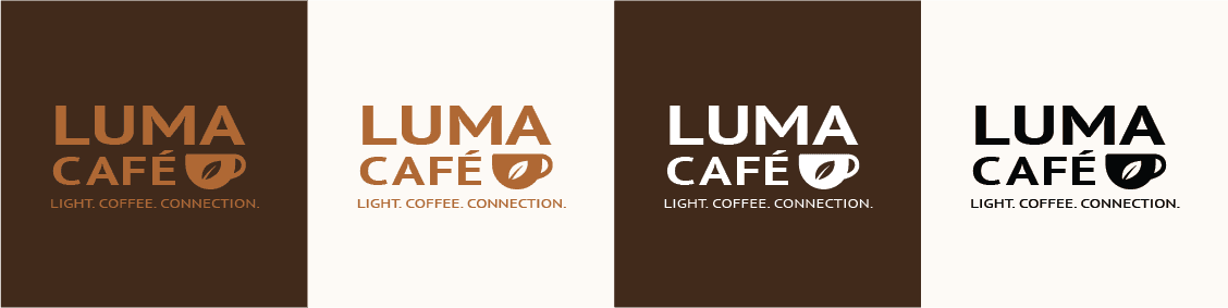
The core visual identity stems from a central icon logo—a framed capsule enclosing a rising sun over a coffee mug accented with a tea leaf. This lockup is anchored by prominent custom typography and the brand tag: "Light. Coffee. Connection." To ensure utility across various touchpoints, a responsive logo system was developed, including a secondary capsule wordmark, a streamlined type-and-mug logo, and a standalone icon.

Color & Pattern:
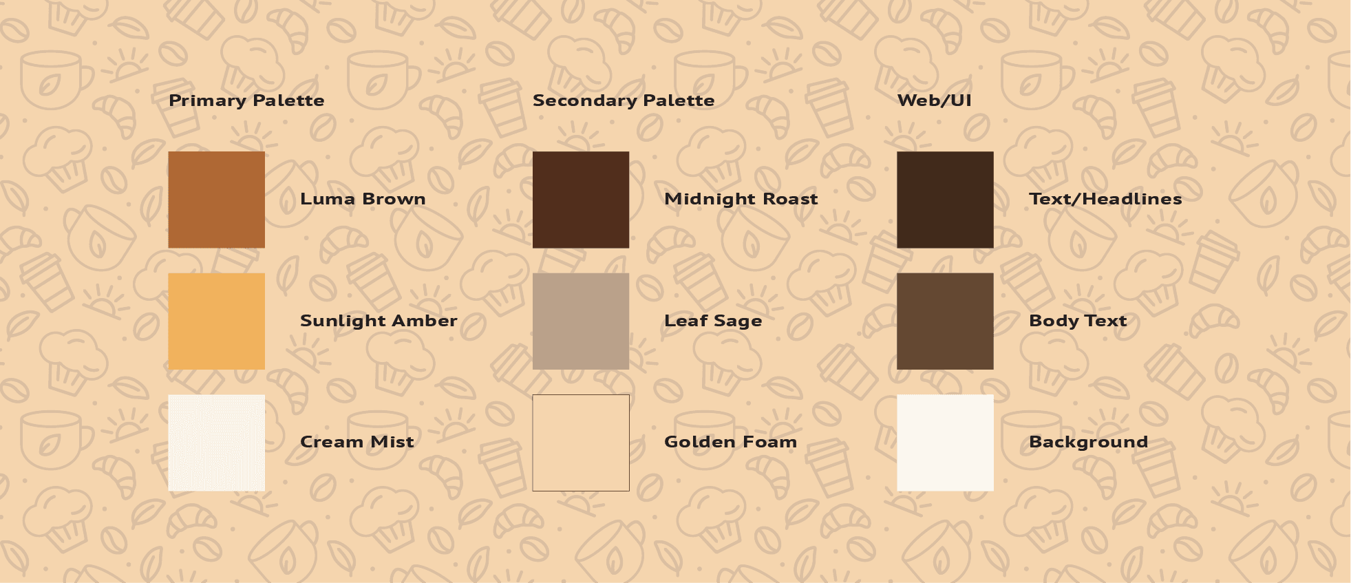
The color strategy uses an intentionally warm, grounding palette of rich browns and earthy tones split into functional primary and secondary tiers for print collateral, alongside a specialized third palette optimized for Web/UI elements. Brand assets are expanded through a custom suite of line-art illustrations and an abstract cream-swirl motif that mirrors the organic textures of the café experience.
The Brand Typefaces:
Collateral & Touchpoints:
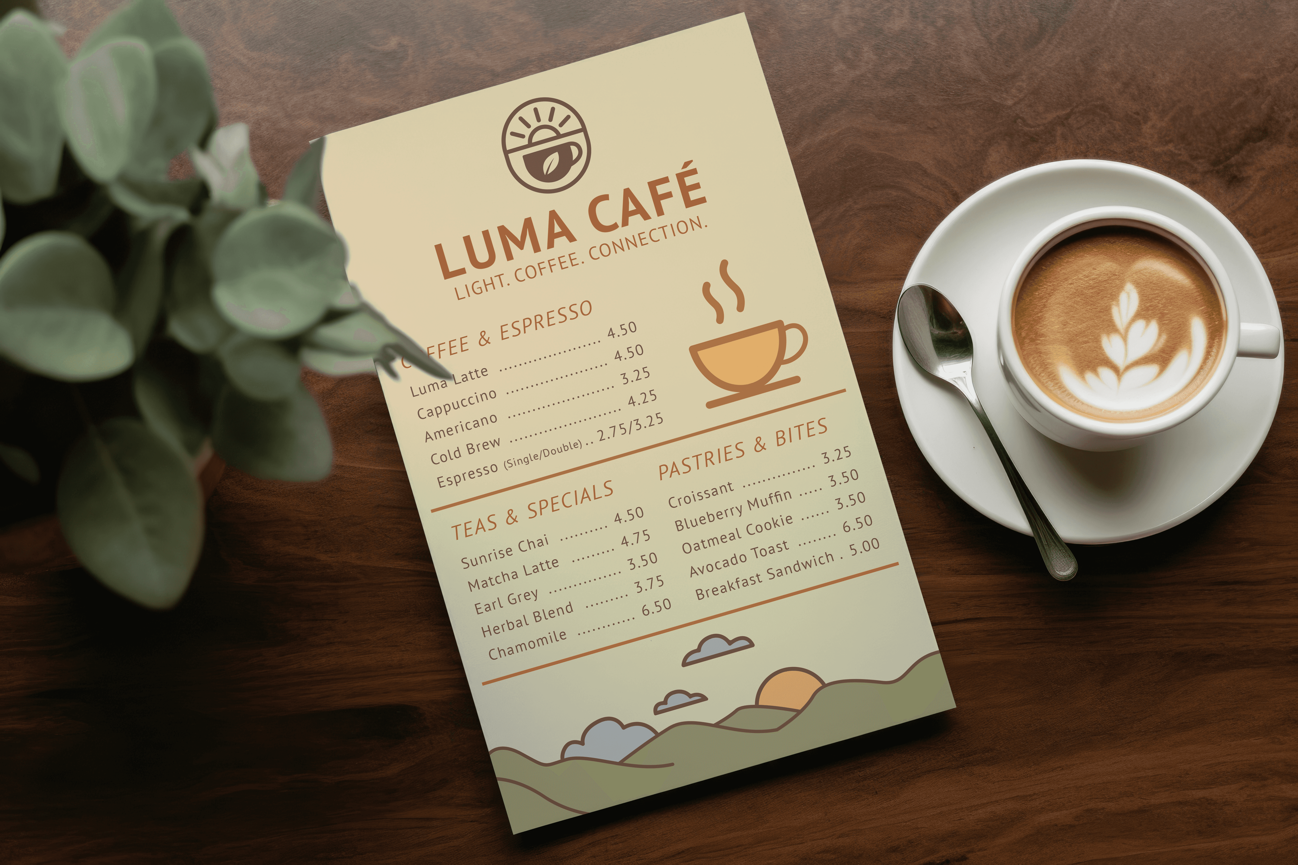
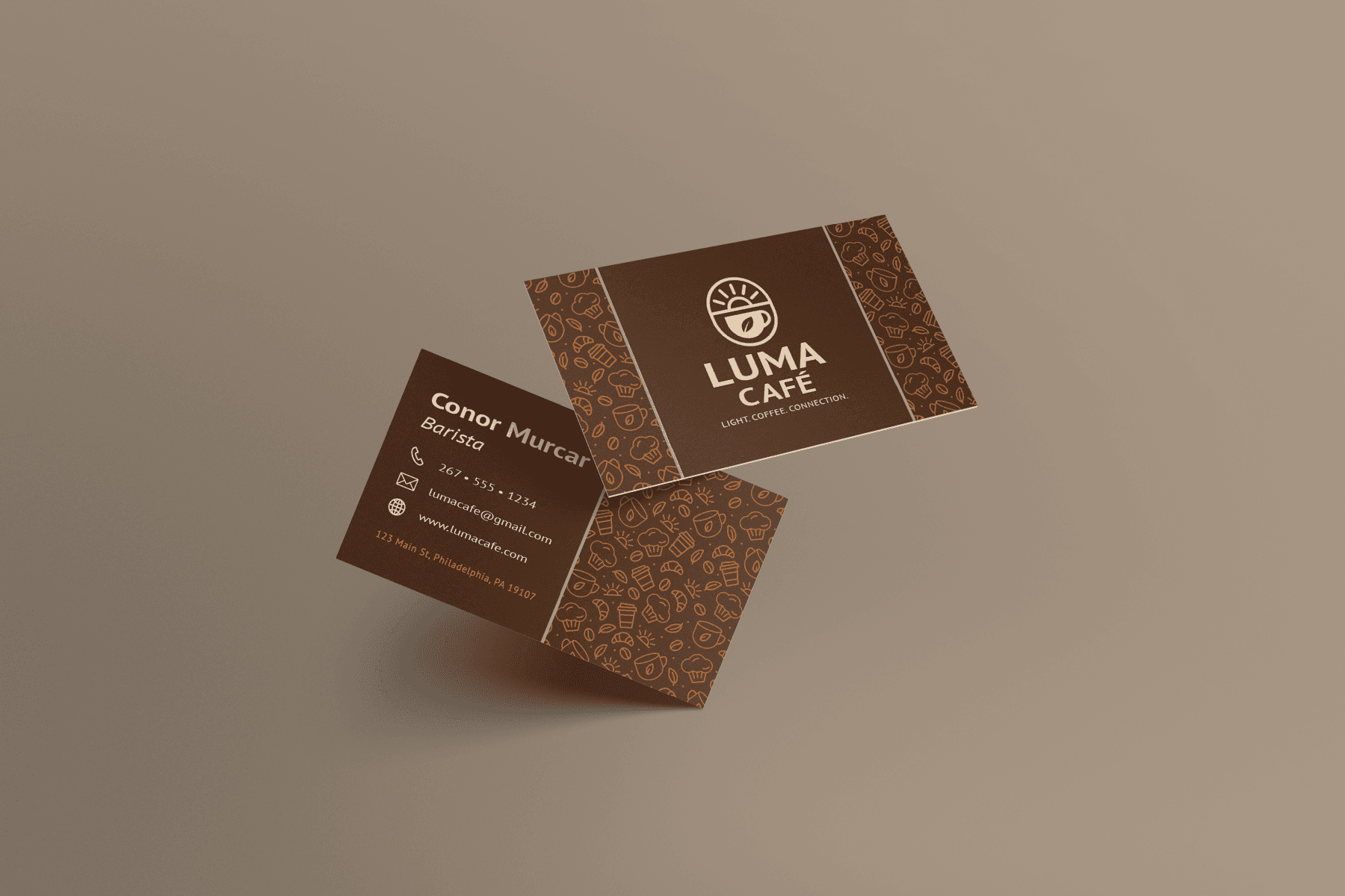
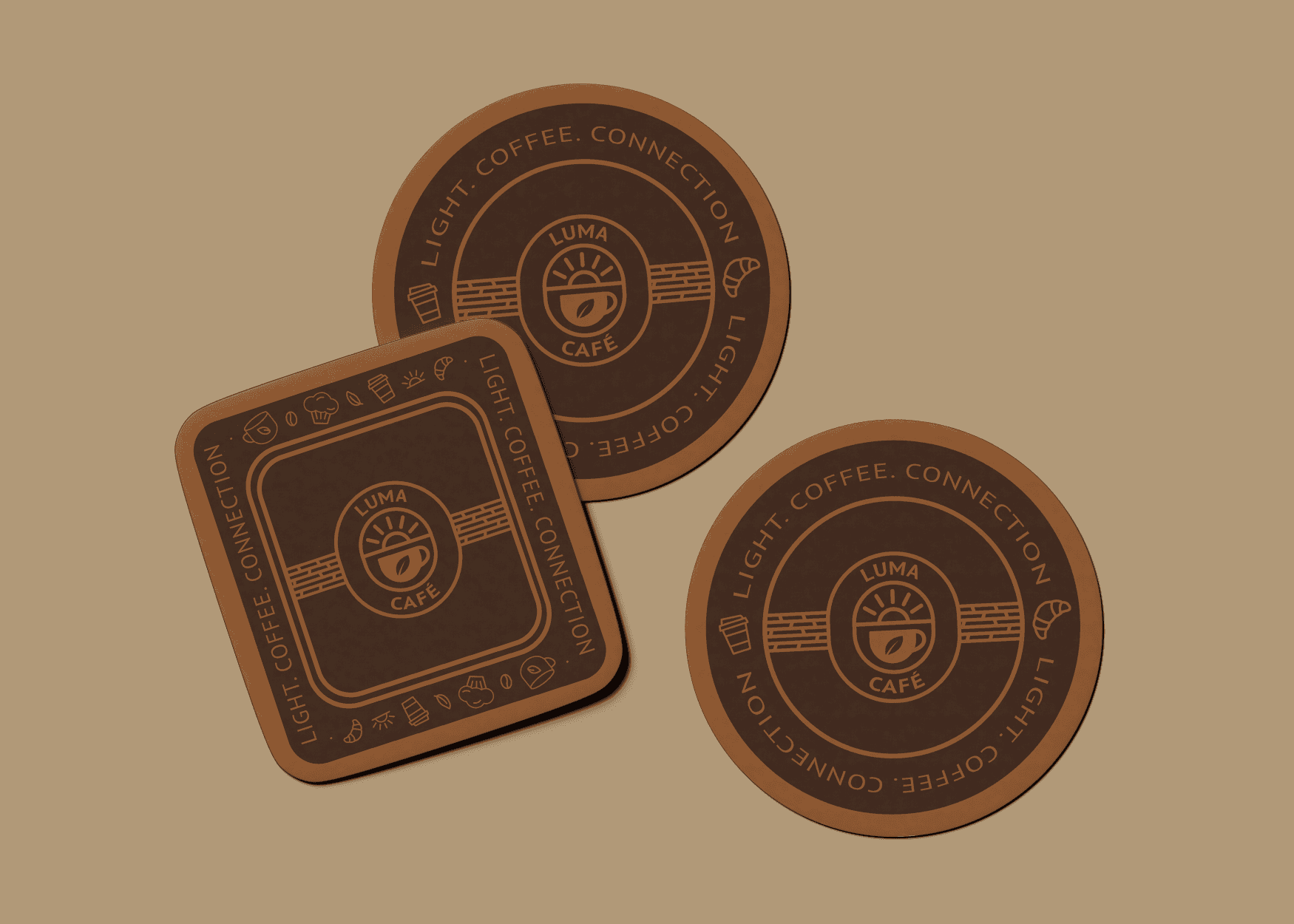
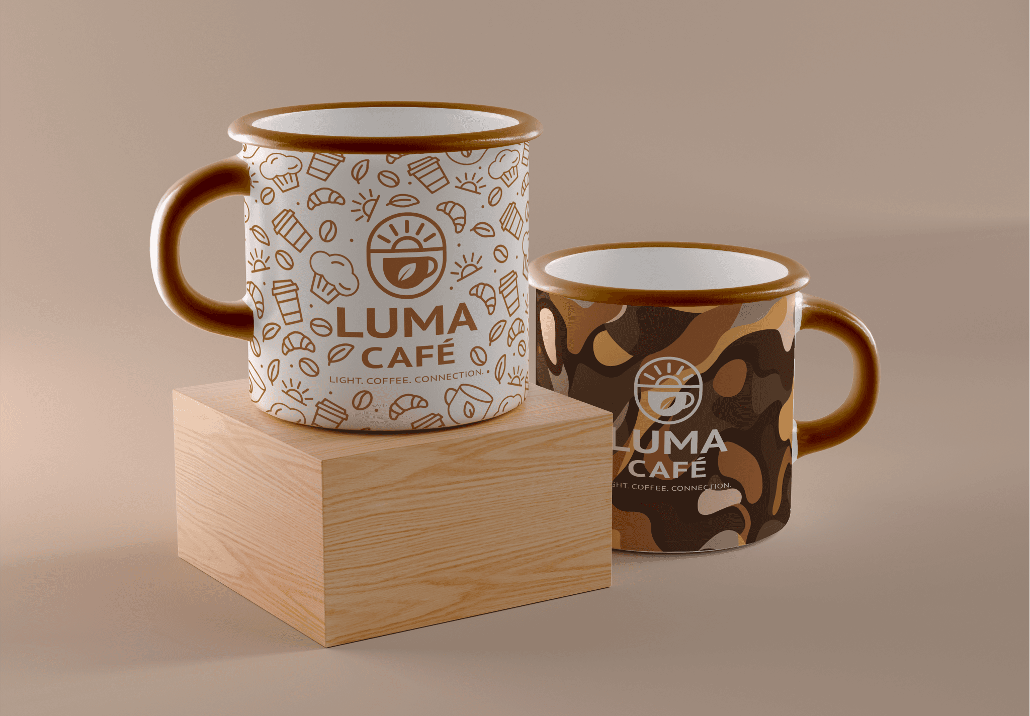
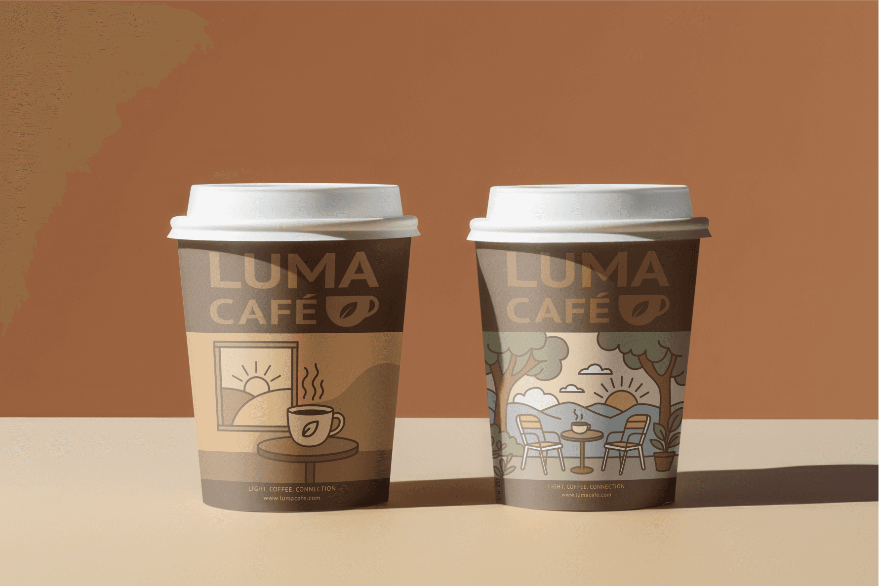
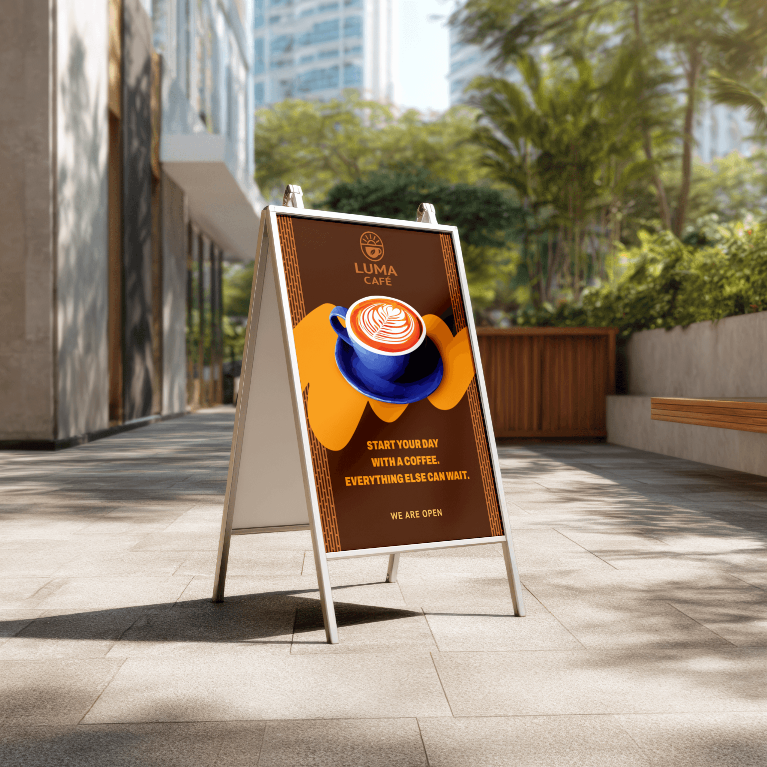
The identity translates into a comprehensive physical and digital rollout. Key deliverables include an illustrated menu system, patterned business cards, custom-stamped coasters, merchandise mugs, dynamic to-go cups, and full-scale environmental storefront graphics paired with an outdoor A-frame sign.