Project Overview:
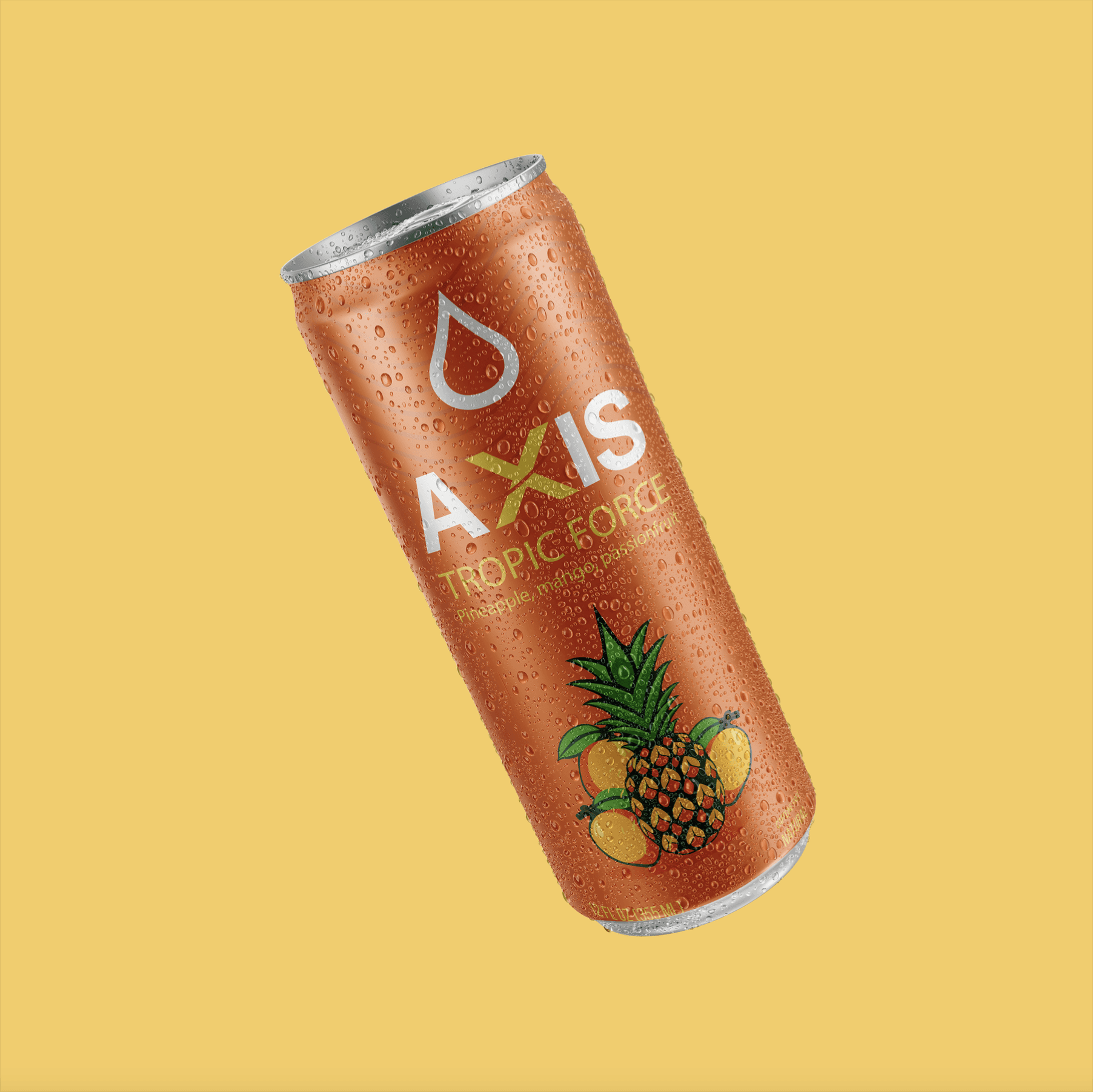
Axis is a conceptual energy drink brand developed as a complete visual identity system across a series of three flavors. The project includes logo design, packaging, custom illustrations, flavor-specific color palettes, and a consistent design language that unifies the product line while giving each flavor its own distinct personality.
Production Layout:
Designed using a commercial shrink-sleeve production template. Primary branding and regulatory information remain within the designated copy area. Background graphics extend to the color area to accommodate production tolerances.

The Logo:
The first step was to design the AXIS word mark. The "X" serves as the focal point of the identity. The cut through the X inspired the wave patterns extending across the can to reinforce themes of energy, movement, and flow. Logo has distinct color variations for different applications and flavors. Positioned above the logo, a simple water droplet icon reinforces the beverage category while adding a recognizable brand mark that can stand alone in future applications.

Color Palette:
Each flavor uses a dedicated color palette inspired by its fruit profile. Consistent typography, layout, and branding elements ensure the products feel unified while remaining easy to distinguish on the shelf.

Illustration Development:
Custom vector illustrations were designed specifically for each flavor using bright, simplified forms to match the energetic branding. These illustrations act as the primary flavor identifier when the product is on the shelf.

Packaging System:
The packaging system was designed around a consistent visual hierarchy that creates a unified brand experience across all three flavors. Each label follows the same layout, allowing the logo, flavor name, and custom illustration to remain instantly recognizable while the color palette distinguishes each product. The subtle wave pattern, inspired by the angled cut through the "X" in the logo, flows across the top of every label to visually tie the packaging back to the brand mark. Beneath the logo, the flavor name is given prominence, followed by a secondary line listing the featured fruits to provide quick product information. The custom illustration occupies the largest visual area of the label, serving as the primary flavor identifier, while product details such as volume and nutritional callouts are positioned along the bottom to complete the composition without competing with the branding.

The combination of the vibrant flavor-specific illustrations and bold typography, the packaging creates a unified brand experience while allowing each flavor to maintain its own unique character.